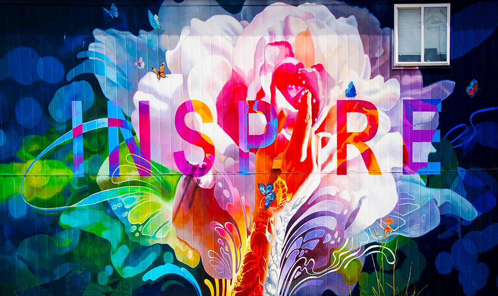
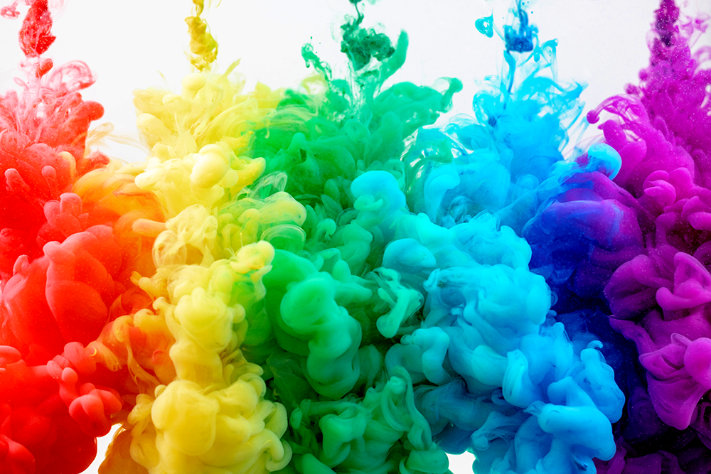
Have you ever stopped to ask yourself why certain colors make us feel a certain way?
Or, why some colors are used more often than others in design?
In this blog post, we'll explore the basics of color theory and discuss the meanings behind some of the most popular colors.
So, if you're curious about color and want to learn more, keep reading!
What is Color Theory?
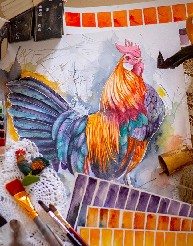
As an artist, understanding color theory is essential to creating harmonious and visually appealing compositions.
But what exactly is color theory?
In a nutshell, color theory is the study of how colors interact with each other.
It takes into account the psychological effects of color as well as the scientific properties of light.
Essentially, it's a set of guidelines for choosing and combining colors to create meaningful combinations.
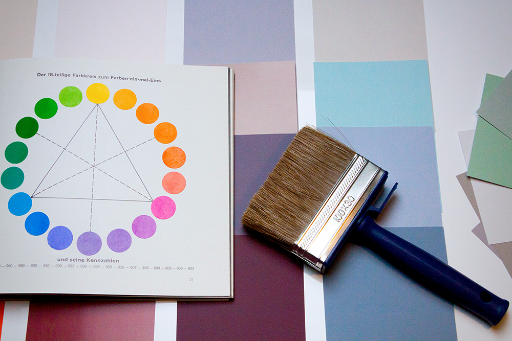
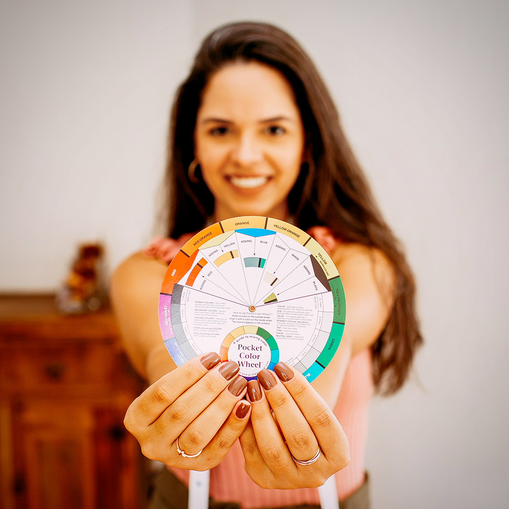
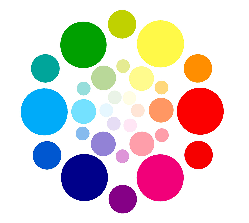
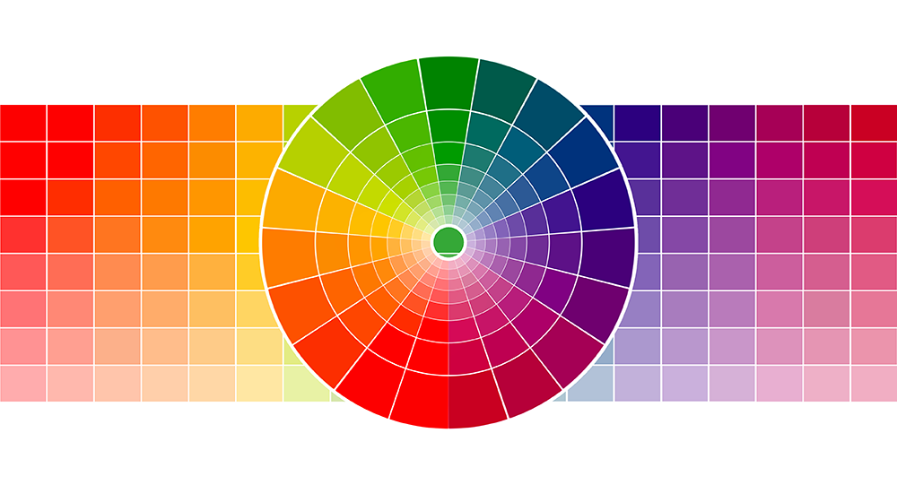
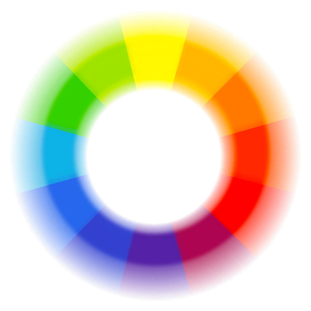
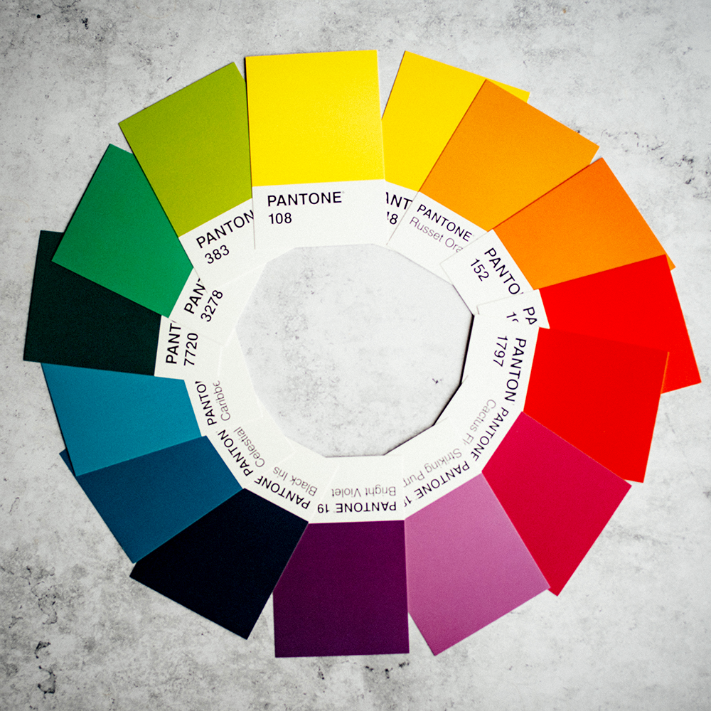
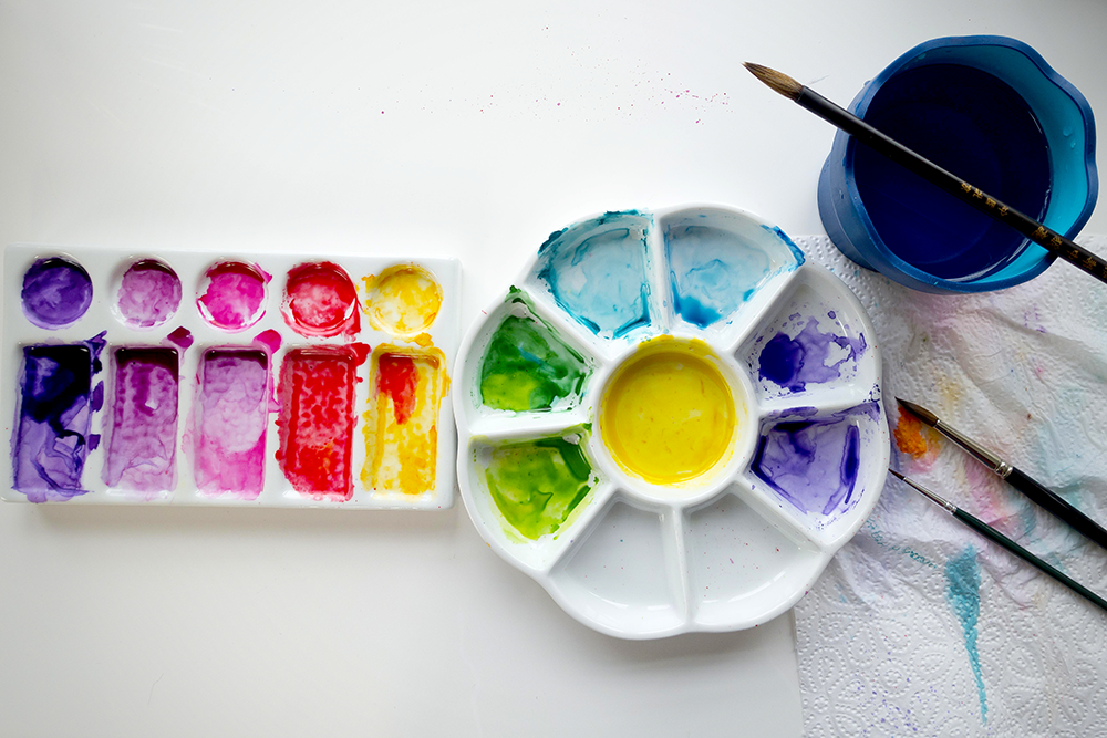
The Color Wheel
A great starting point for understanding color theory is the color wheel.
The wheel was created by Sir Isaac Newton and represents all possible hues of visible light.
It's usually divided into three main sections: primary colors, secondary colors, and tertiary colors.
The color wheel can be used as a tool for choosing harmonious color schemes and the color palette for your next project.
Monochromatic color schemes use only one hue or variations of the same color family.
A complementary colors consists of two colors that are opposite each other on the wheel (i.e. red and green).
An analogous color scheme consists of three colors that are next to each other on the wheel (i.e. yellow-green, yellow, and yellow-orange).
A triadic color scheme consists of three colors that are evenly spaced around the wheel (i.e. red, yellow, and blue).
A tetradic color scheme consists of four colors that are evenly spaced around the wheel (i.e. red, orange, green, and blue).
A rainbow color scale consists of six respective hues that are evenly spaced around the color wheel (i.e. red, orange, yellow, green, blue, and purple).
An additive color model is based on the colors of light and consists of red, green, and blue.
A subtractive color model is based on the colors of pigments and consists of cyan, magenta, yellow, and black.

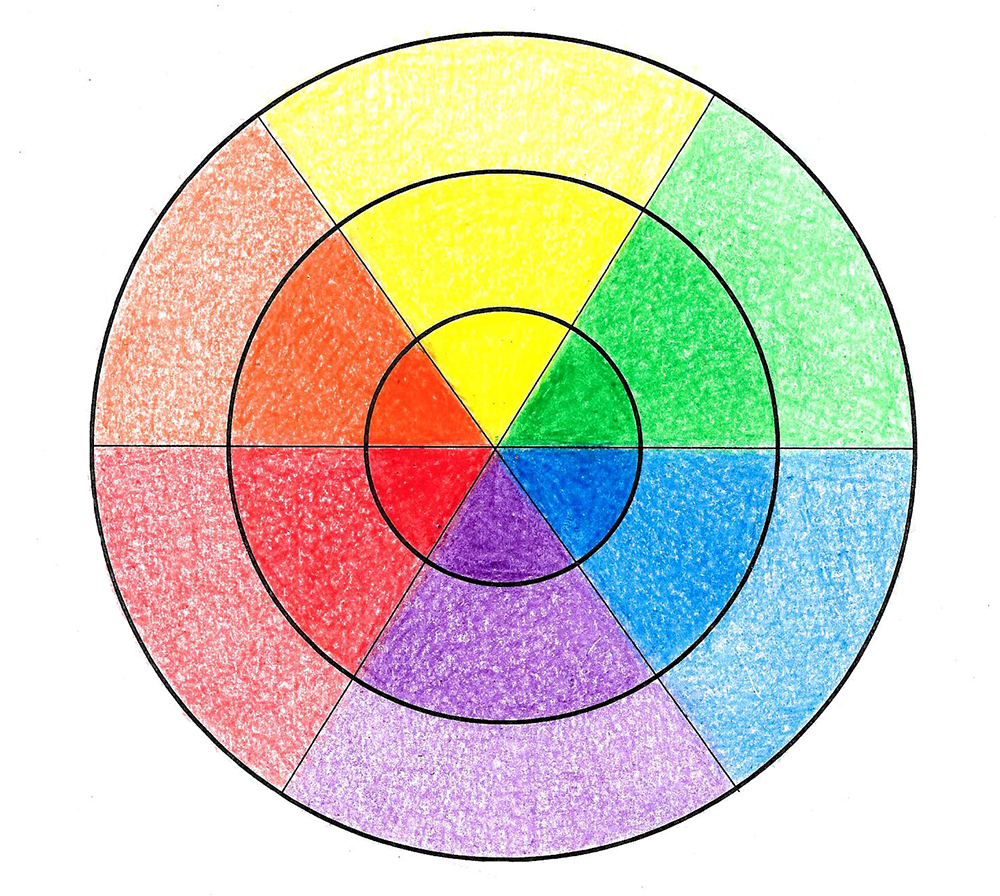
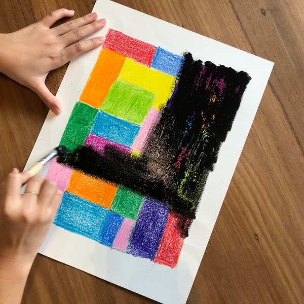
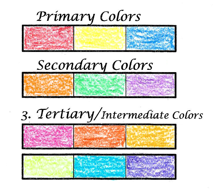
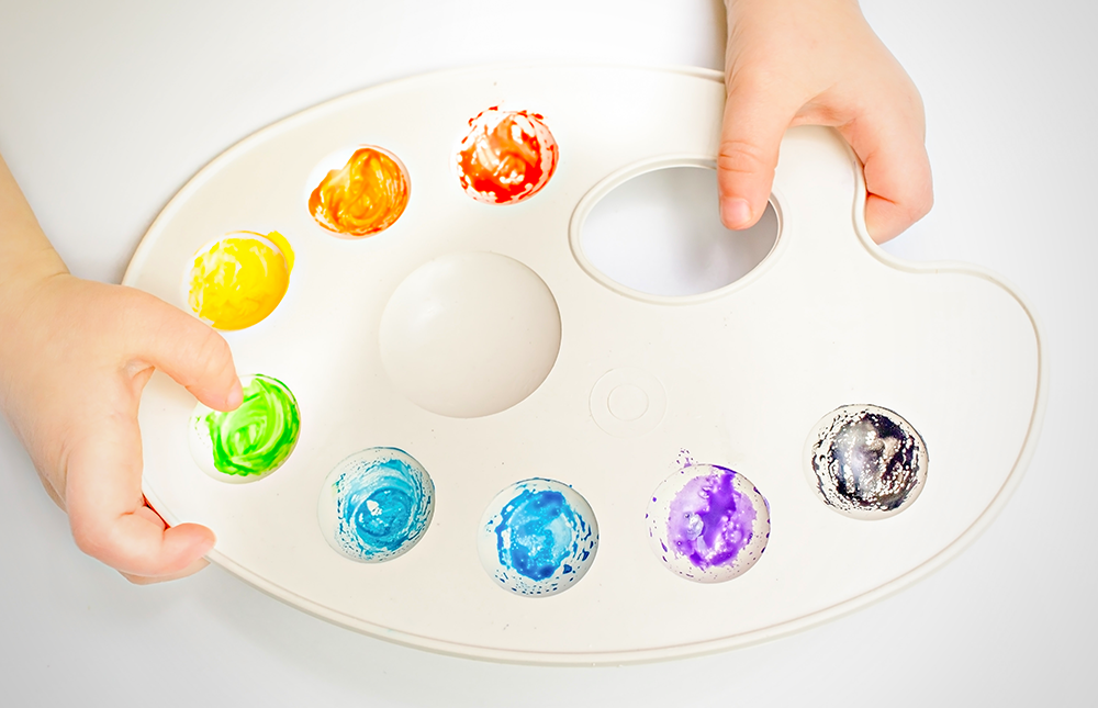
Primary Colors
Red, yellow, and blue are called primary colors, which cannot be made by mixing any other colors together.
All other colors are created by combining these primary colors in different proportions.
For example, mixing red and yellow together creates orange, while mixing red and blue creates purple.
Primary colors are the building blocks of all other colors and are used extensively in design.

Secondary Colors
Secondary colors are created by mixing two primary colors together.
For example, mixing red and yellow together creates orange, while mixing blue and yellow creates green.
These colors are often used to add contrast and visual interest to a design.

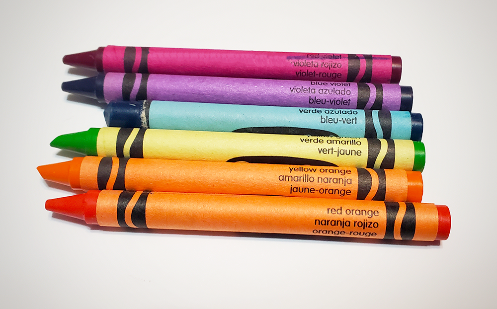
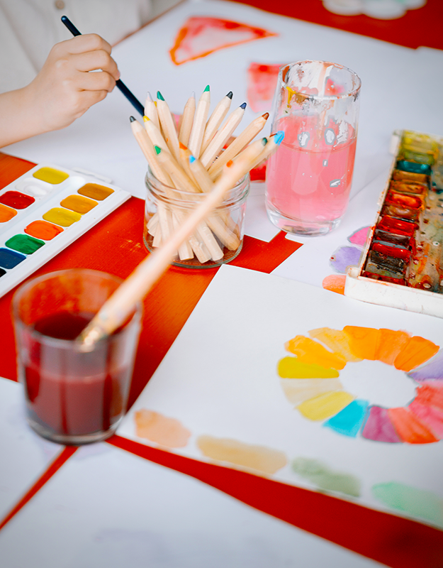
Tertiary Colors
Tertiary colors are created by mixing one primary color with one secondary color.
For example, mixing yellow and orange together creates yellow-orange, while mixing blue and green creates blue-green.
The tertiary colors include red-orange, yellow-orange, yellow-green, blue-green, blue-violet, and red-violet.
These colors are often used to add subtle details and texture to a design.
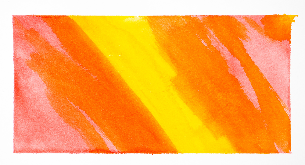
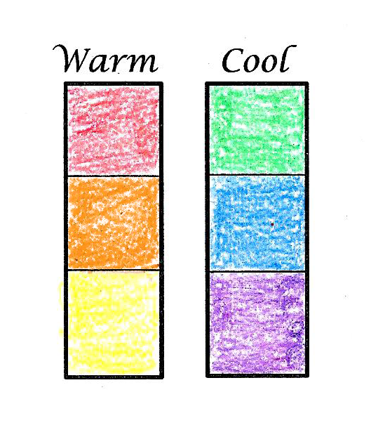
Color Temperature
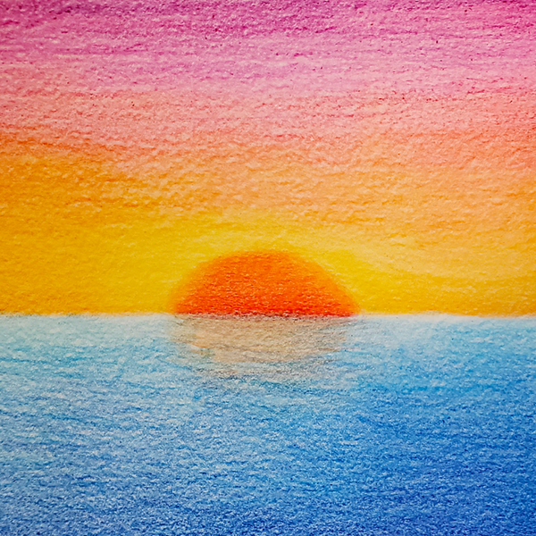
In addition to being able to combine colors to create new ones, you can also create different effects by varying the temperature of a color.
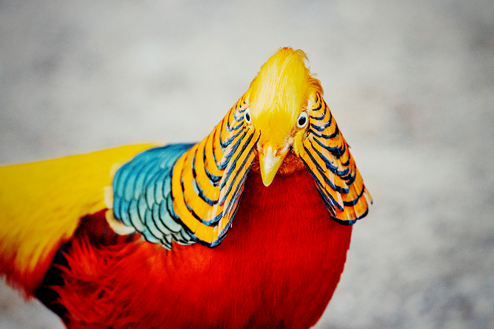
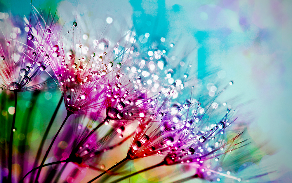
Warm colors—such as reds, oranges, and yellows—tend to be more energizing, while cool colors—such as blues and greens—tend to be more calming.
This can be used to evoke different emotions in your compositions.

Value
Value refers to the lightness or darkness of a color.
A color's value can be changed by adding white (to make it lighter) or black (to make it darker).
The term "hue" refers to the actual color, while "value" refers to the lightness or darkness of that color.
A "tint" is a hue that has had white added to it, while a "shade" is a hue that has had black added.
These terms are used widely in design and can be used to create interesting color relationships.
Value is an important consideration when planning a composition because values can be used to create the illusion of depth or distance.
For example, objects that are further away tend to appear lighter in value than objects that are closer up.
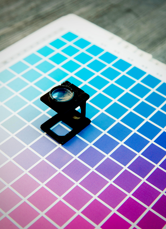
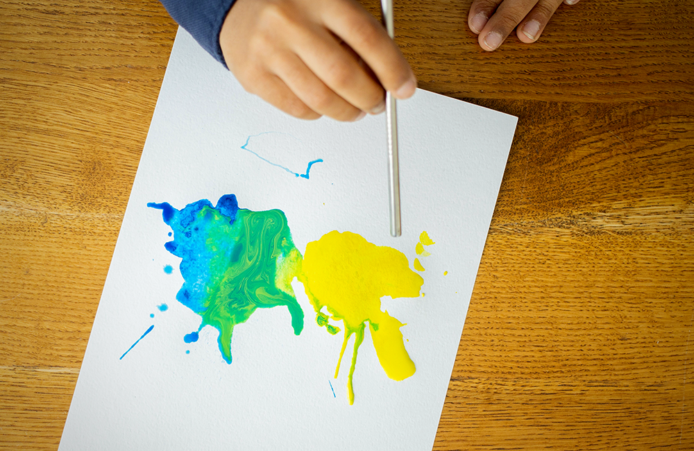
Saturation
Saturation refers to the intensity or purity of a color.
A color can be made more saturated by adding pure pigment (if it's an oil or acrylic painting) or by increasing the amount of paint on your brush (if it's watercolor).
To create a less saturated color, you can add white or gray to the color.
When you add gray to a color, it is called a "tone."
This can be used to create subtle variations in hue that add depth to a composition.
Saturation is an important factor when it comes to choosing colors for a design since it can affect how the colors appear.
Saturated colors tend to be more eye-catching than de-saturated ones.
However, it's important to use them sparingly so as not to overwhelm your viewer.
By combining these aspects of color—hue, value, and saturation—you can create interesting and harmonious color schemes for your designs.

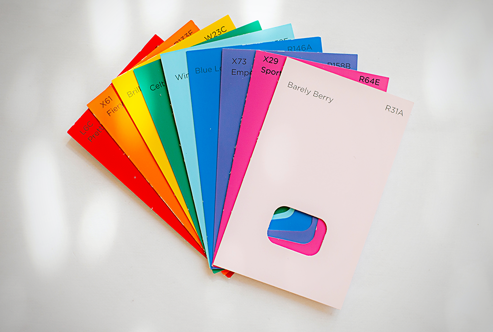
Meaning of Colors
In addition to the scientific properties of color, there are also some cultural and psychological associations with different colors.
Different colors can have different meanings and connotations.
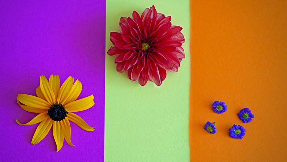
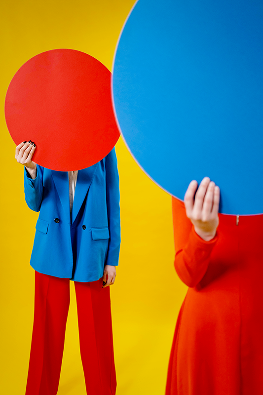
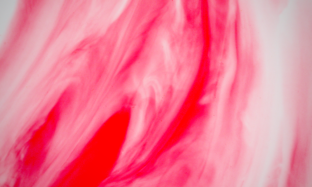
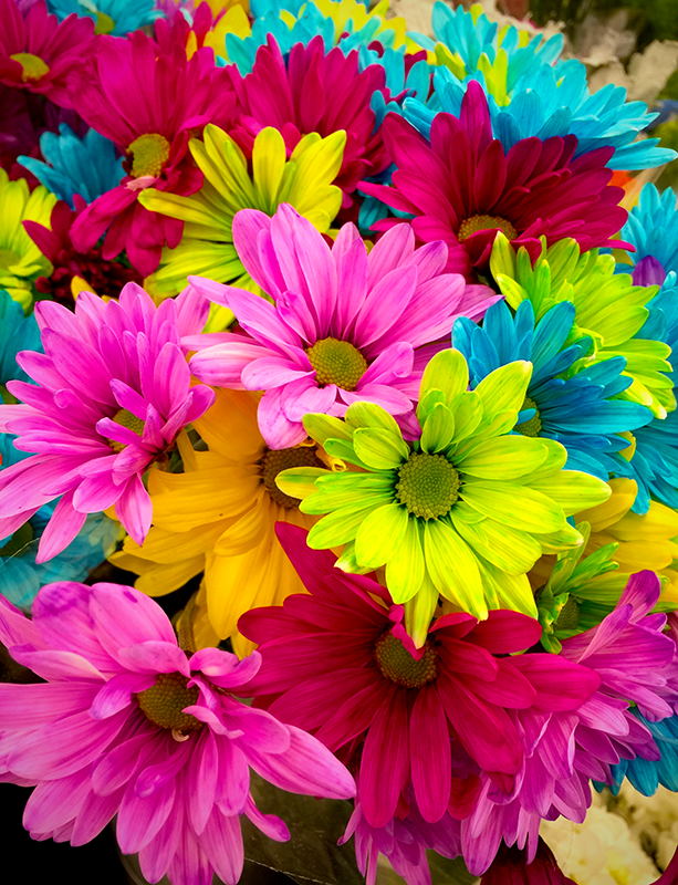
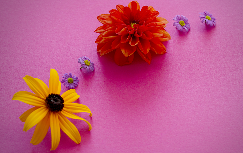
For example, in many cultures red is associated with passion, while blue is associated with calm and trustworthiness.
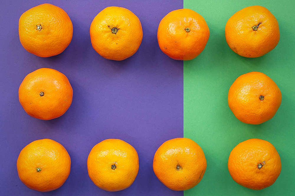
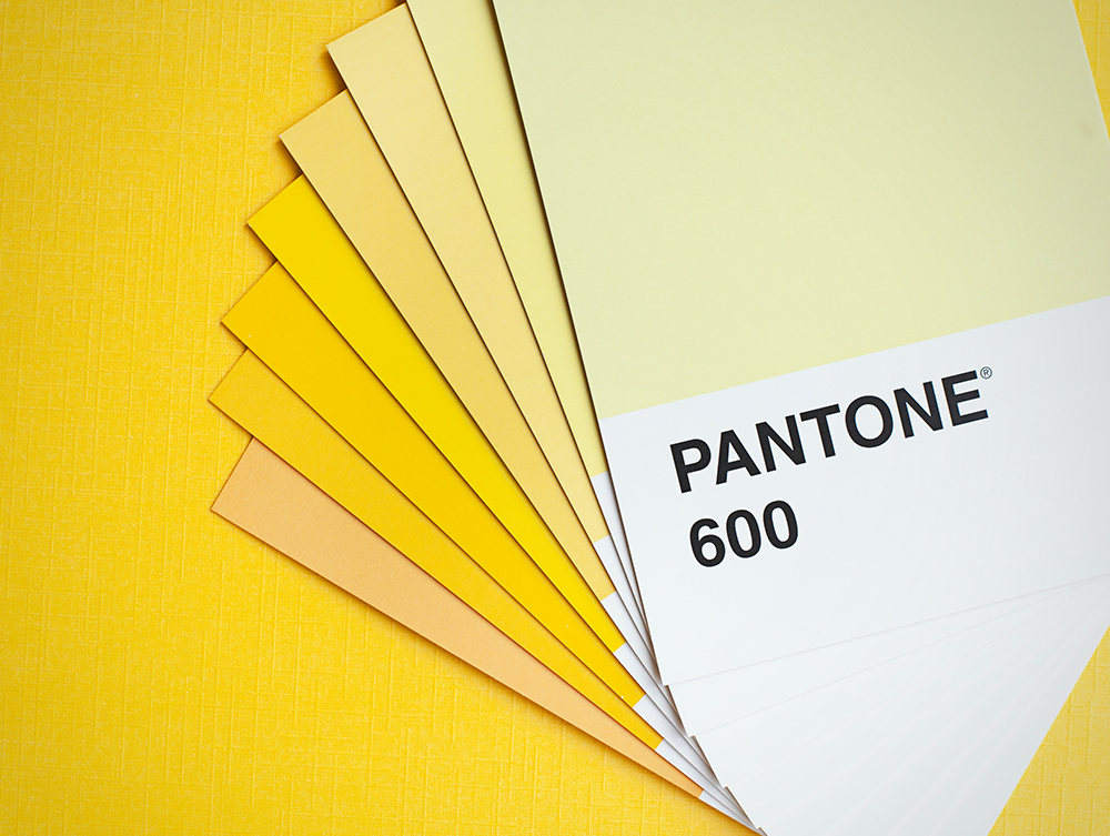
Orange is often associated with warmth and energy, while yellow is often seen as cheerful.
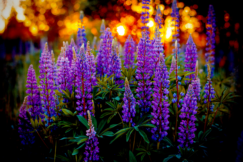
The color green is often associated with nature and growth, and purple is associated with royalty and luxury.
Considering the meaning of colors when creating a design will help you add meaning to your designs.
It's important to consider these meanings when choosing colors for a design, as the wrong choice can have an unintended effect.
By understanding the scientific and cultural aspects of color, you can create a design that conveys your intended message in an effective way.
Using color effectively can help make your designs stand out and create an impact.
Understanding and Using Color Theory
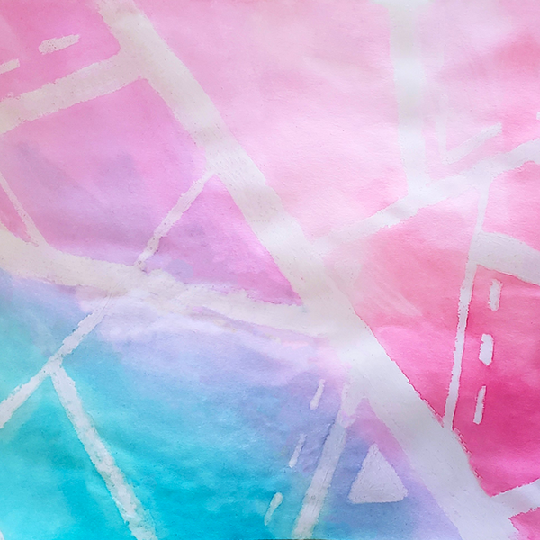
Color theory is a complex subject with a lot of moving parts, and color harmony is vital for creating beautiful compositions.
By understanding how to mix, match, and manipulate color, you can create stunning designs that really stand out.
These basics are essential for any artist who wants to create harmonious and visually appealing compositions.
By familiarizing yourself with these concepts, such as the color wheel, color temperature, value, saturation, and meaning, you'll be well on your way to becoming a master of color!
Once you understand these concepts, you can use them to create color palettes that work with your design and evoke the desired emotion from your viewer.
With the right application of color theory, you can create designs that are truly captivating and effective.
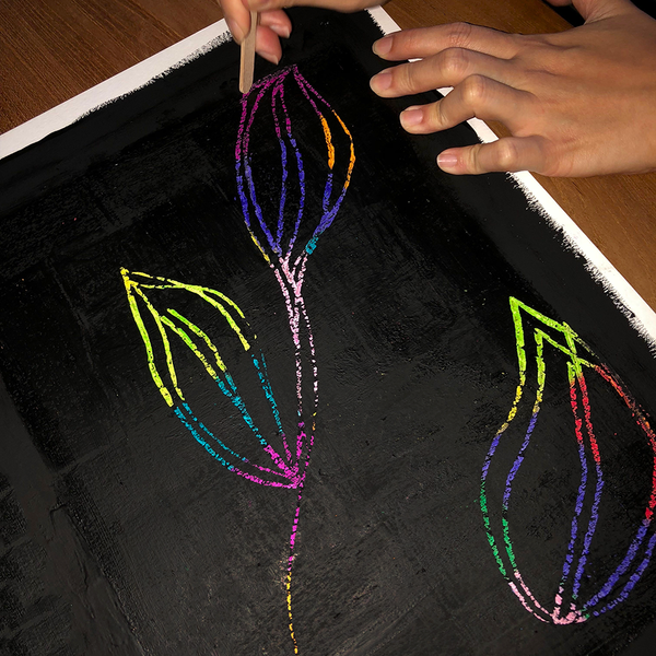
So, explore your talents, live creatively, and challenge yourself to create a work of art using the principles of color theory!
Happy creating!
Interested in learning more about color theory? Check out Brad's Art School's video!
Want even more content about creativity and art?
Be sure to check out all of our creative chronicles!
If you're looking for inspiration for your art, check out some of our other articles:
-Finding inspirational music for creativity
-Building creative confidence in your abilities