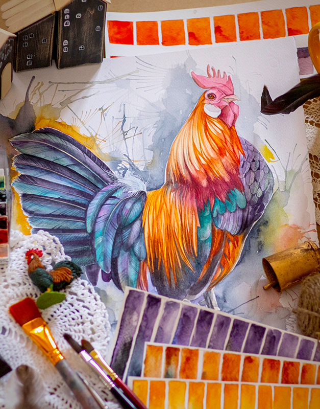
Using Primary, Secondary, and Tertiary Colors
The color wheel is a essential tool for artists of all skill levels.
By understanding color wheel basic knowledge, like how to use it, you can create beautiful works of art using a range of colors.
In this blog post, we'll break down the basics of the color wheel and explain how to use primary, secondary, and tertiary colors in your artwork.


The Basics of the Color Wheel
There are different types of color wheels, some deal with visible light while others focus on pigment hues.
Depending on your color wheel chart, you will see different colors.
For example, white light is broken down into red, green, and blue while the primary colors in art are red, yellow, and blue.
he color wheel is composed of three main different types of colors: primary, secondary, and tertiary.
Each group of colors is important in it's own right, and you've probably learned about at least some of them in school.
Understanding these groups, as long as different color schemes like warm and cool colors, complementary color schemes, and analogous color schemes, will allow you to create harmonious combinations in your art.
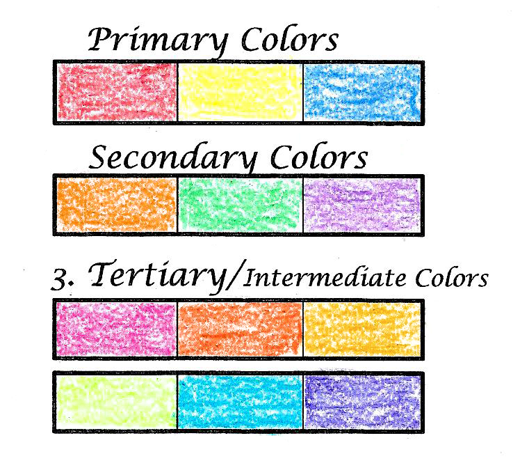
Primary Colors
As you might guess from their names, primary colors are the most basic and important colors.
Primary colors are the colors that cannot be made by mixing other colors together.
Odds are, you are most familiar with these colors.
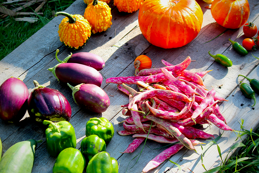
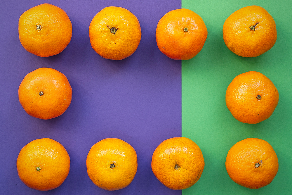
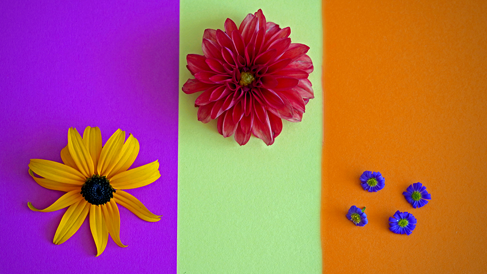
There are only three primary colors: red, yellow, and blue.
You can use these three colors to create the other colors on the color wheel.
Secondary Colors
Secondary colors are created by mixing two primary colors together.
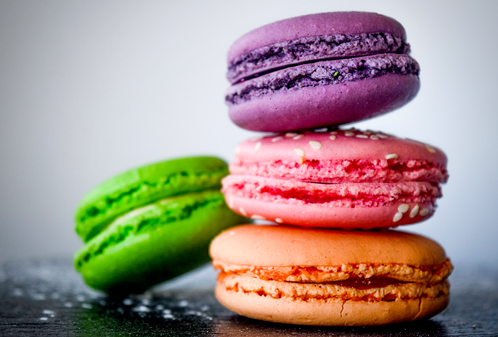
There are three secondary colors: orange, green, and purple.
You create orange by mixing yellow and red.
Green is created by mixing blue and yellow.
Finally, purple (or violet) is created by mixing red and blue.
Tertiary Colors
The final group is the tertiary colors.
These colors are also known as intermediate colors, and you're probably least familiar with this group of colors.
Tertiary colors are created by mixing a primary color with a secondary color.
These intermediate colors include: red-violet, red-orange, yellow-orange, yellow-green, blue-green, and blue violet.
As the names suggest, you get tertiary colors by combining a secondary color with a primary color.


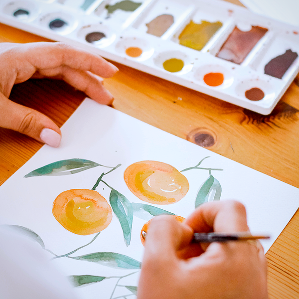
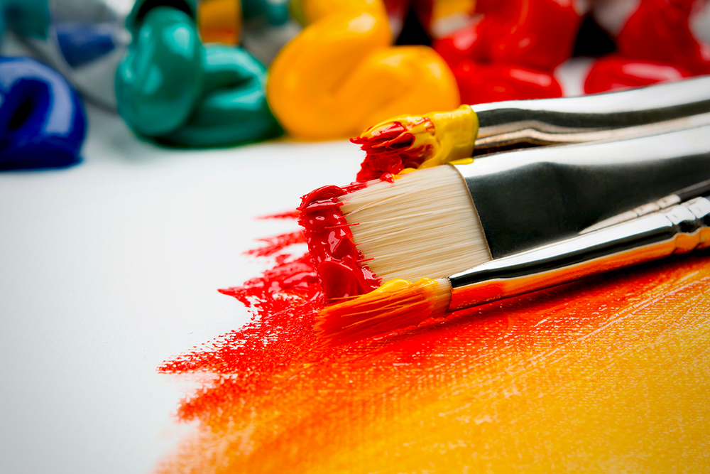
Using Color in Your Art
Now that we've gone over the basics of the color wheel, let's talk about how you can use it in your artwork.
When it comes to creating art, the color wheel can be a helpful tool for choosing colors that complement each other.
This is especially true if you're working with limited colors.


How to Use Primary Colors in Your Artwork
Primary colors are used as the building blocks for all other colors on the color wheel.
Because they can't be created by mixing other colors together, they're considered to be the most pure form of color (alongside black and white).
When using primary colors in your artwork, you have complete control over the hue (the type of color), value (how light or dark the color is), and saturation (how intense the color is).

How to Use Secondary Colors in Your Artwork
Secondary colors are less pure than primary colors because they're created by mixing two different colors together.
When using secondary colors in your work, you'll still have control over hue, value, and saturation.
However, you'll also need to consider the two colors that were used to create the secondary color.
For example, if you're using orange in your artwork, you'll need to take into account the yellow and red that were used to create it.
Depending on how "pure" you want your secondary colors, you'll have to be mindful of the color ratios.
Too much of one primary color will skew your hue, and you can end up with a tertiary color (not that it's necessarily a bad thing).

How to Use Tertiary Colors in Your Artwork
Tertiary colors are created by mixing a primary color with a secondary color.
As a result, they inherit some of the same qualities as both primary and secondary colors.
When using tertiary colors in your artwork, you'll have control over hue and saturation but generally not value.
This is because tertiary colors tend to be either very light or very dark—it's rare to find a middle ground.
You can always try mixing in white or black if you want your color to be lighter or darker in value.
Just be aware that this will change the hue of your color.


Using the Color Wheel for Your Next Project
The color wheel is a essential tool for artists of all skill levels.
By understanding how to use it effectively, you can create beautiful pieces of art using a wide array of primary colors, secondary colors, tertiary colors and everything in-between!
Now that you know the basics of the color wheel, you can start putting it to good use in your artwork!
Remember, the color wheel is a helpful tool for choosing colors that complement each other.
So, if you're ever feeling stuck or just want to try something new, pull out your color wheel and start experimenting!
Don't be afraid to play with color; stay creative and inspired!


Want to learn more about color theory basics? Check out Sarah Renae Clark's video!
Want to learn more about making primary, secondary, and tertiary colors? Check out Easy Hands' video!


Want to learn more about color?
Check out some of our other guides on all things color: