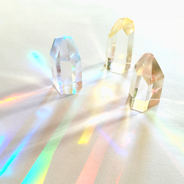
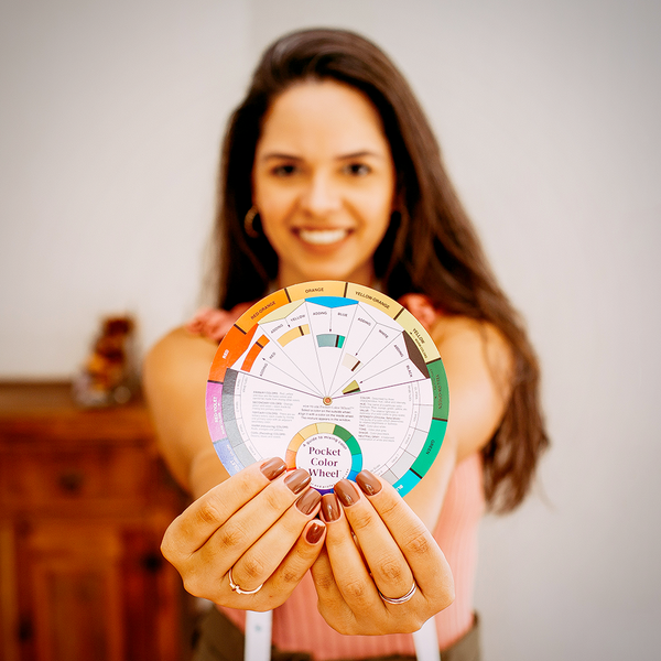
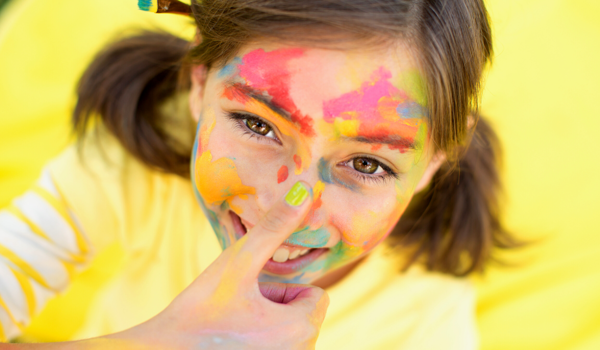
Are you ready to unlock the power of color?
If your answer is "yes" then get settled in and prepare to be amazed as we explore all the ways that color can influence our mood, emotions, mental state and more!
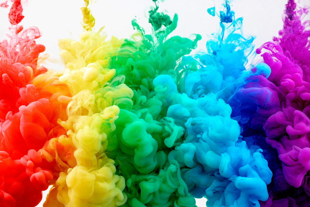
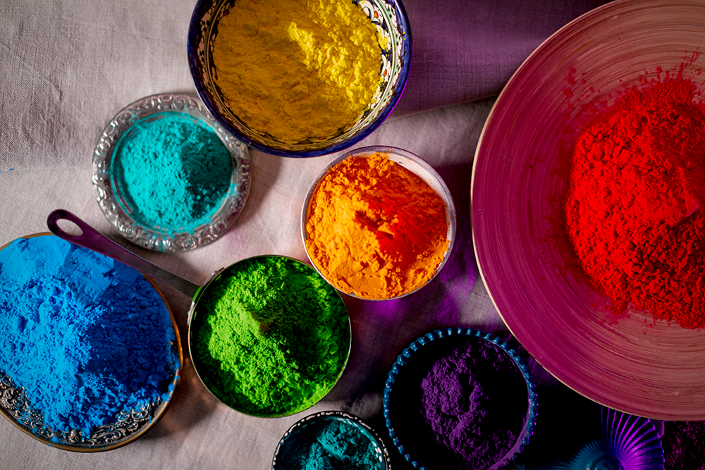
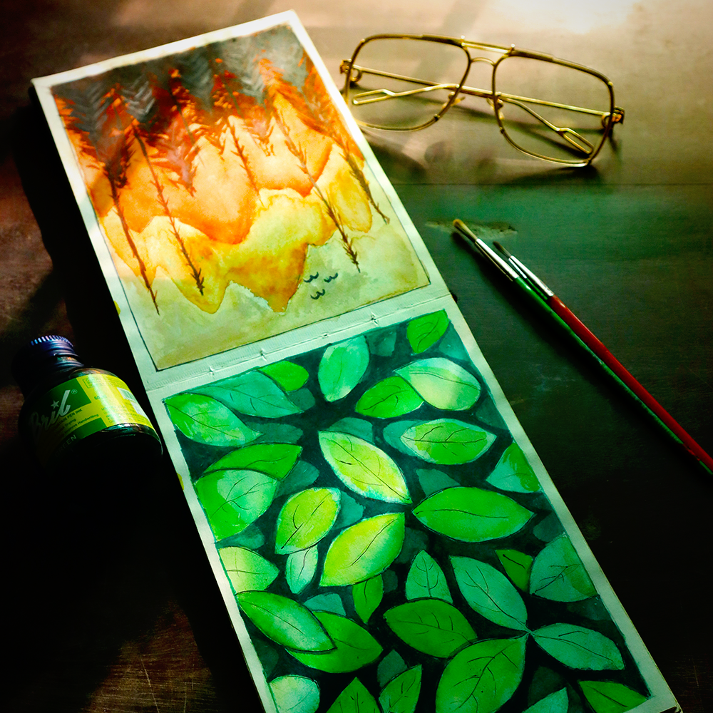
From vibrant oranges and greens bringing life into an otherwise dull canvas, to subtle blues calming a chaotic scene – each hue has the potential to take us on a unique emotional journey.
We’ve all heard that “the color red is for passion,” or “the color blue is for calmness.”
But beyond these simple statements, how much do you know about the effects of color on mood and emotions?
It turns out, there is a lot more to it than you might think!
As an artist, you already know that color plays a significant role in the art you create, but it also impacts mood, emotions, and overall psychology.
Learn how different colors can evoke specific feelings and how you can use this knowledge for creative inspiration; it's time to explore the science of color therapy and how different colors can be used to benefit your mental and physical health.
So, let’s dive into the mysteries of color theory and the basics of understanding how color impacts our mood and emotions!
The Psychology Behind Color and Mood
It is important to note that when discussing the psychology behind color, we are speaking in generalities.
Everyone experiences colors differently, so take this information as a starting point rather than a hard and fast rule.
Each color is associated with a unique set of feelings and emotions that can be used to evoke certain moods or create specific atmospheres in a space.
That being said, let’s explore some of the most common associations between color and emotion.
- Red:
Red evokes strong feelings of energy, passion, aggression, love, and determination.
It can also be used to convey danger or warning.
As such, it is often used in branding campaigns focused on strength or power.
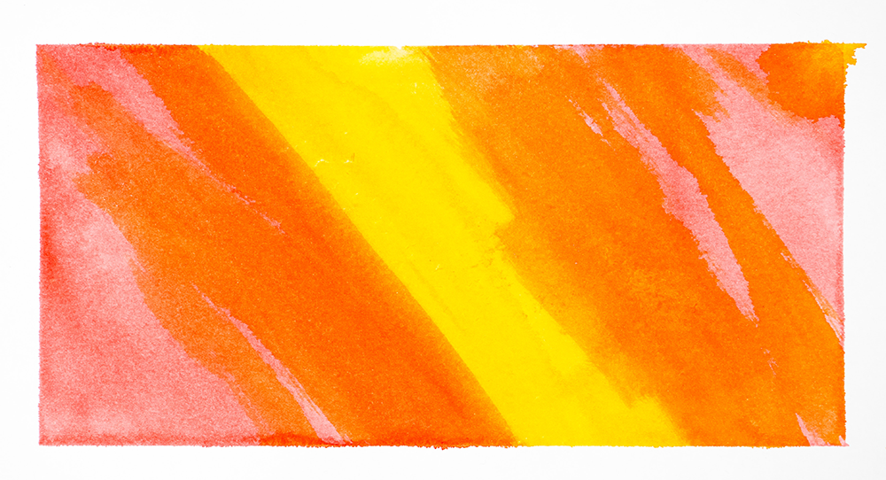
- Orange:
Orange has a stimulating effect on people's emotions.
It is often associated with friendliness, enthusiasm, creativity, warmth and comfort.
It can also be used to capture attention or create energy in marketing campaigns.
Yellow has been known to make people feel happy due to its sunny disposition, but it can also cause feelings of anxiety if overused or misused due to its overwhelming brightness.
Yellow is typically seen as optimistic but it should be used sparingly in branding campaigns, as too much yellow can be off-putting.
The color green is often associated with nature, growth, and calming properties.
It can be used to promote relaxation, balance, and well-being.
Green is also a color of wealth and abundance which can be used to great effect in marketing campaigns.
As such, the green color can be an ideal choice for businesses looking to establish trust with their customers.
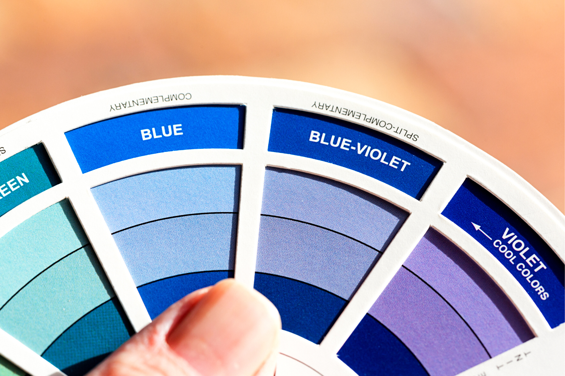
- Blue:
Blue tends to have a calming effect on people's emotions due to its association with tranquility and serenity.
However, blue can also evoke feelings of sadness or depression depending on its shade or hue.
Light blues are often used in branding campaigns aimed at creating a peaceful atmosphere while dark blues are better suited for those looking for power and prestige.
A blue room can be a great choice for relaxation but too much blue can lead to feelings of depression or sadness. .
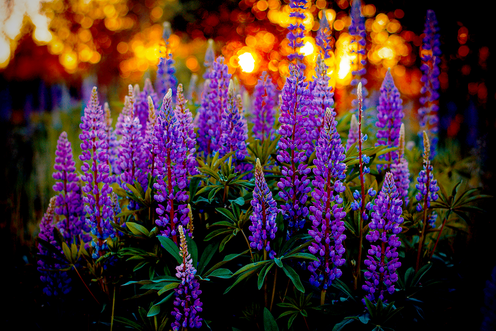
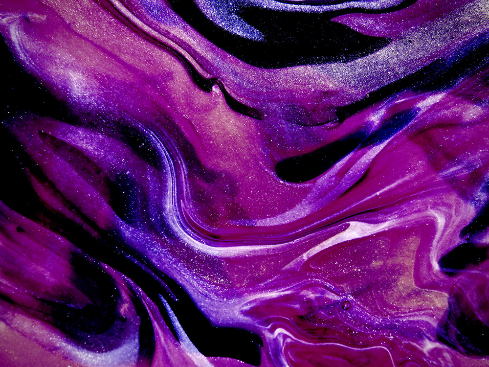
Purple is often associated with royalty, luxury and sophistication.
It can also be used to evoke feelings of creativity, mystery and imagination.
The color purple is often used to add a touch of elegance and sophistication to art, design, and branding projects.
Purple can be used to great effect in branding campaigns aimed at conveying wealth, power and sophistication.
- Pink:
Pink is a light and cheerful color that often evokes feelings of joy, happiness and romance.
It can also be used to create a calming and soothing atmosphere.
Pink is most often used in branding campaigns aimed at women, children or young adults.
White is often used to convey cleanliness, purity and simplicity.
It can also be seen as a blank canvas which makes it ideal for businesses looking to convey a minimalist aesthetic.
White can also be used to create feelings of openness and spaciousness in a room or space.
Black is a powerful and often mysterious color that can evoke strong feelings of strength, power, authority, and sophistication.
It can also be used to create a sense of mystery or intrigue in branding campaigns.
However, too much black can be overwhelming and even depressing so it should be used sparingly.
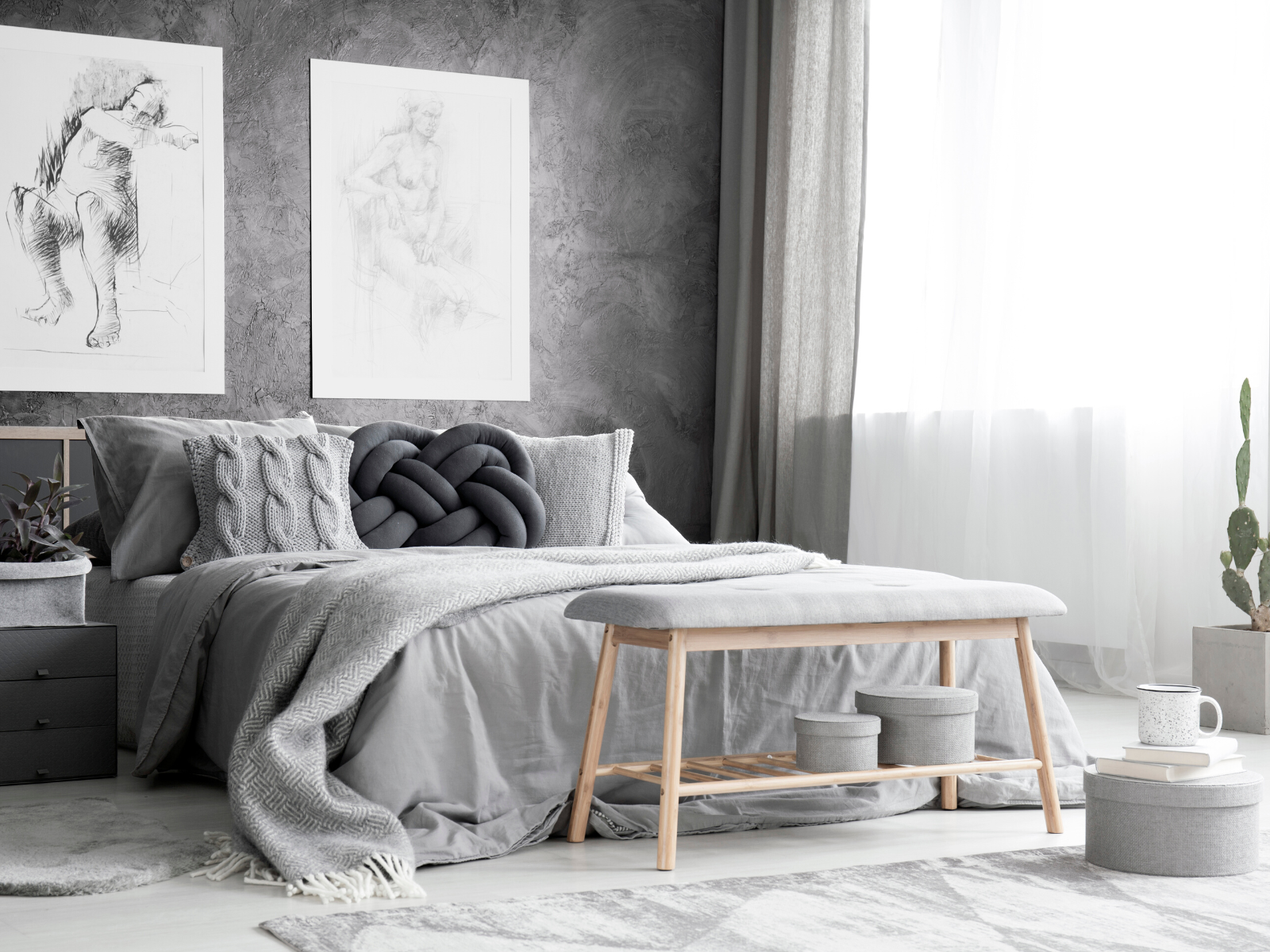
- Gray:
Gray is a neutral color that conveys feelings of neutrality, balance and stability.
It can also be used to create a sense of formality and professionalism in branding campaigns.
Gray is a perfect choice for businesses looking to convey an air of sophistication without being too overpowering or flashy.

What is Color Therapy?
Color therapy, also called chromotherapy, is a holistic healing practice that uses different colors to balance and heal the body or mind.
Color therapy is based on the idea that each color has a unique frequency, vibration or energy that can have an effect on the human body.
By exposing the eyes, skin, or body to a specific color or light frequency/light therapy, color therapy practitioners believe that healing can occur.
The color spectrum has been used for centuries in healing rituals, meditation, and spiritual practices.
Today, color therapy is widely accepted as a form of alternative medicine, and it is gaining traction in the medical and psychological communities.
Color therapy has been used to treat a variety of ailments such as depression, anxiety, fatigue, insomnia, blood pressure, and even physical pain.
The use of color for healing is an ancient practice that has been around for centuries, but it is only recently that the scientific community has begun to understand and acknowledge its potential benefits.
For example, studies have shown that exposure to red and blue light can help reduce inflammation and promote healing in wounds.
Color therapy is not just limited to physical healing though.
It has also been used as a form of psychological and emotional therapy due to its ability to evoke specific feelings and emotions.
By understanding how colors affect mood, emotions and overall psychology, practitioners can use color to help their clients work through psychological issues and gain insight into their emotional state.
Whether you are an artist looking for creative inspiration, a business owner wanting to create the right brand identity, or a therapist looking to help your clients, understanding the power of color can have profound effects.
Unlock the potential of color and use it to your advantage – explore the psychology behind color and discover how it can influence your mood and emotions.
You never know what you might find!
The Psychology of Colors
The power of color is undeniable – it can evoke strong emotions, influence our mood, and even trigger physiological responses.
But how does this work?
What makes colors so effective at influencing our psyche?
The answer lies in color psychology.
In psychology, colors have different meanings and associations.
For example, red is often associated with passion, energy and excitement while blue can evoke feelings of tranquility and peace.
Purple is associated with royalty and luxury, whereas pink is associated with femininity and romance.
Bright yellow can lift our mood, while darker shades of yellow can cause feelings of anxiety.
Black is associated with darkness and negativity, whereas white is associated with purity and cleanliness.
These associations are largely based on cultural norms, but they can also be influenced by our individual experiences and span across cultural differences.
As such, the same color can evoke different feelings and emotions in different people.
Color preferences can also vary from person to person.
Some people might prefer warm colors such as red and yellow while others may be drawn to cool colors such as blue and purple.
The colors we choose to surround ourselves with can say a lot about our personalities and our preferences.
By understanding the psychology of colors, we can begin to understand how they can be used to influence our mood and emotions.
From stimulating our creativity to calming us down, understanding the power of color can be a powerful tool for creative expression and emotional healing.

Tapping into Color Therapy
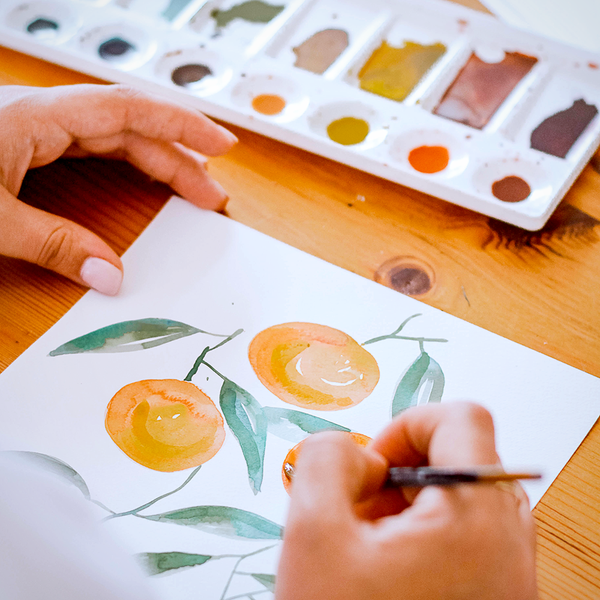
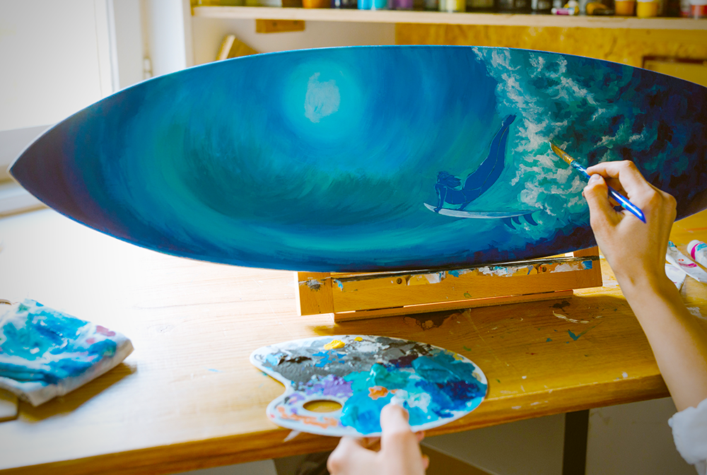
As an artist, you can use color therapy to create a certain mood or emotion in your artwork.
By understanding the psychological and physiological effects of different colors, you can create art that can soothe or energize the viewers.
Here are some tips to get started with color therapy in your artwork:
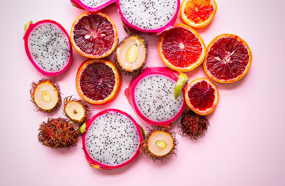
- Use Warm Colors for Energy:
Warm colors like red, orange, and yellow can help energize the viewer and create a sense of warmth and excitement.
These colors are great for creating bold and dramatic art.
- Use Cool Colors for Calmness:
Cool colors like blue, green, and purple can create a sense of calmness and relaxation.
These colors are great for creating tranquil and harmonious art.
Green accents can add a sense of growth and natural energy.
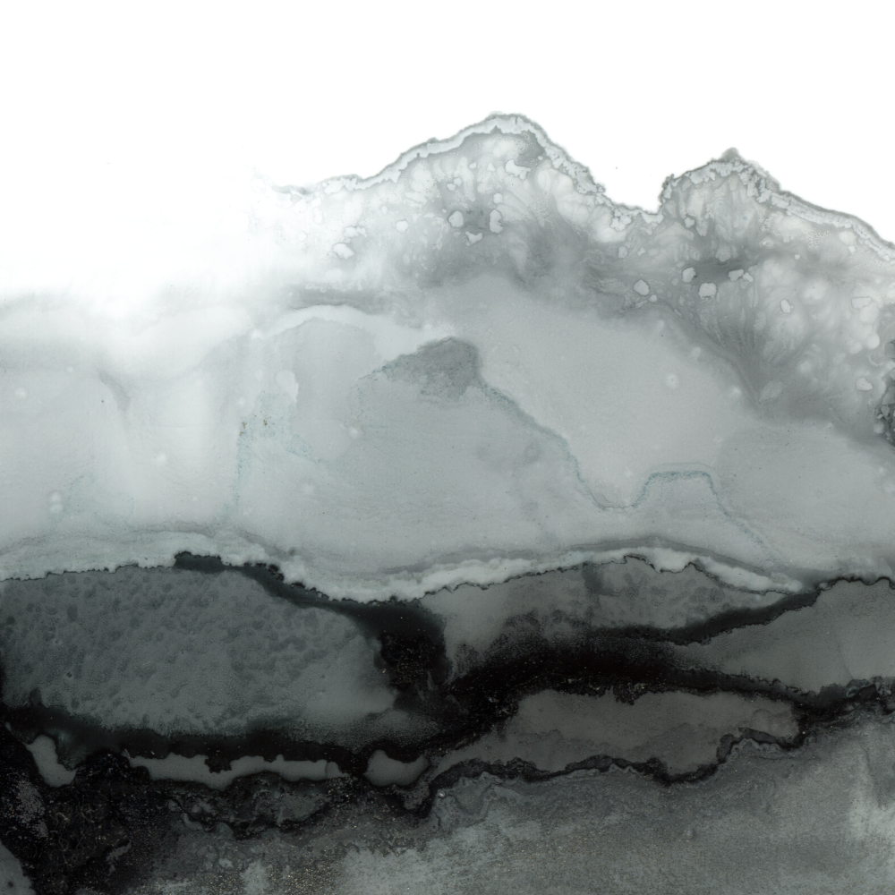
- Use Neutral Colors for Balance:
Neutral colors like white, gray, and black can create a sense of balance and stability.
These colors are great for creating minimalist artwork to evoke feelings of order and cleanliness.
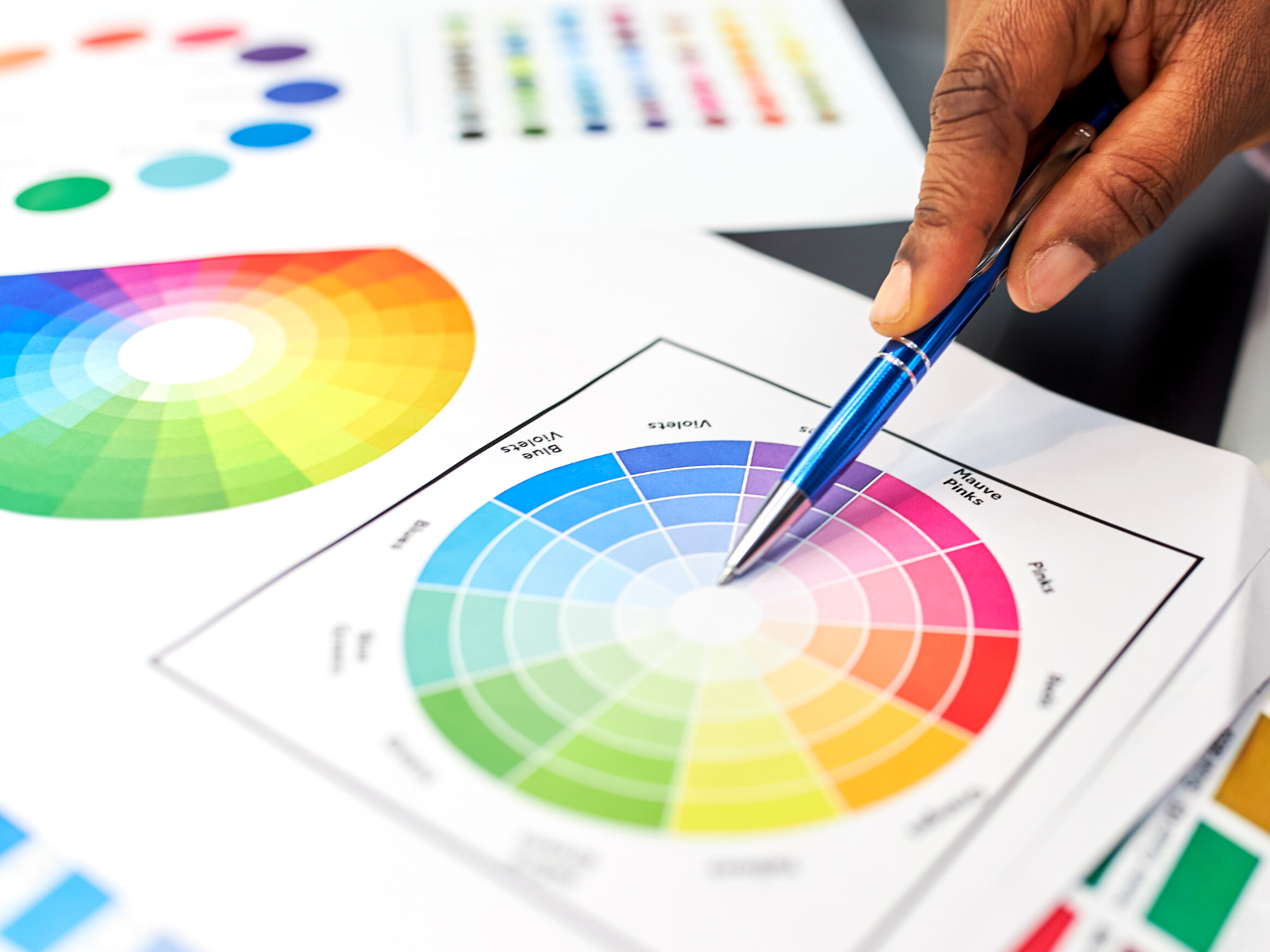
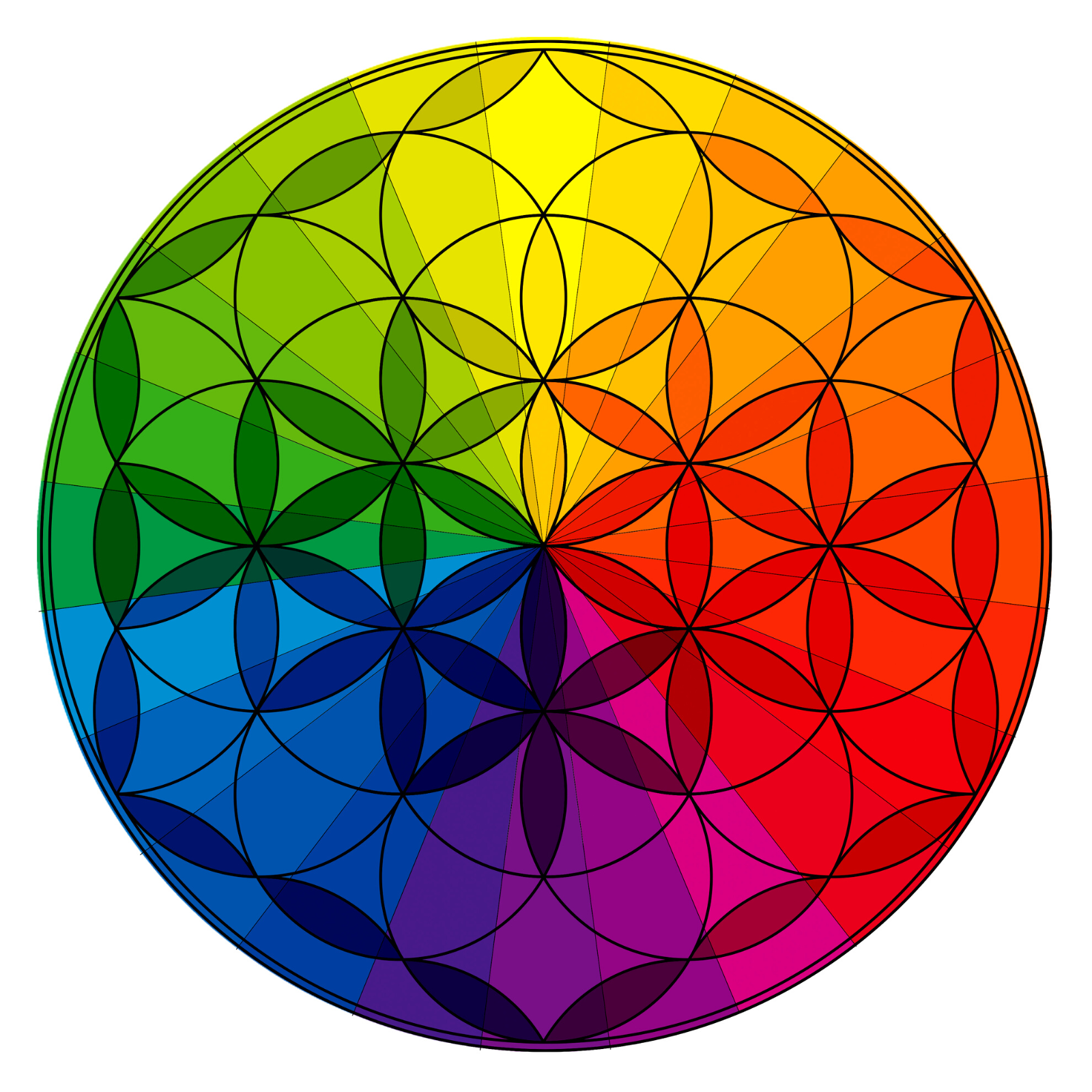
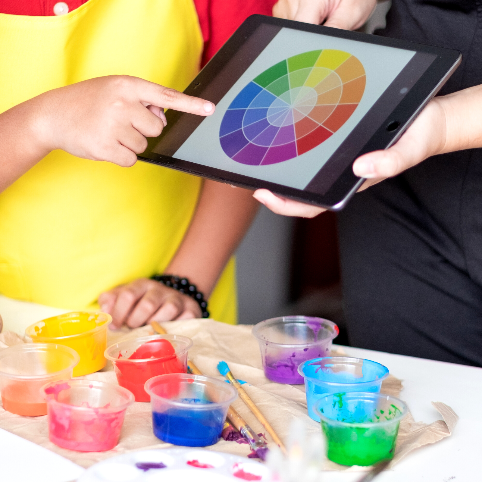
- Use Complementary Colors for Contrast:
If you want to create contrast and drama in your art, try using complementary colors.
Complementary colors are opposite to each other on the color wheel and can create tension when used together.
- Use Analogous Colors for Harmony:
Analogous colors are next to each other on the color wheel and can create a sense of harmony and unity in your art.
- Use Monochromatic Colors for Mood:
Monochromatic colors are different shades of the same color and can create a sense of mood and emotion in your art.
For example, different shades of blue can create a sense of calmness and tranquility.
These are just a few tips to help you incorporate color therapy into your artwork.
By understanding the psychology of colors and experimenting with different hues and shades, you can create art that’s visually pleasing and has the power to evoke strong emotions.
Benefits of Color Therapy
Color therapy has several benefits for mental and physical health.
Some of the benefits of color therapy are:
- Stress Relief: Color therapy can help reduce stress and anxiety and promote relaxation.
- Improved Mood: Color therapy can improve mood and increase feelings of happiness and well-being.
- Physical Healing: Color therapy can be used to treat physical ailments and promote physical healing.
- Improved Creativity: Color therapy can help improve creativity and inspire new ideas.
- Increased Energy: Color therapy can help increase energy and motivation.
If you are looking for a holistic way to improve your mental and physical health, color therapy might be the right choice for you.
Color psychology is a great way to encourage positive emotions and manage negative emotions.
By understanding the psychological effects of color and experimenting with different hues and shades, you can use color to your advantage – creating art that is visually pleasing and emotionally healing.
Discover the power of color therapy and unlock its potential to enhance your creativity, improve your mental health, and promote physical healing.
When we understand the power of color and experiment with different colors and shades, you can unlock its potential and use it to your advantage!
The Power of Color
Color therapy is a fascinating field that can help improve our mental and physical health because colors and emotions go hand in hand.
As an artist, you can use color therapy to create artwork that can soothe, energize, or inspire your viewers.
By understanding the impact of different colors on mood, emotions, and psychology, you can create art that not only looks beautiful but also has a powerful effect on the human body and mind.
Taking the time to consider how color influences our emotions is an important part of effective art-making because it ensures that your message resonates with your target audience in the intended way.
You don't want your customers feeling overwhelmed by too many bright colors or depressed by dark shades!
Play around with different combinations until you find something that works for your goals.
Whether you are an artist looking to tap into the power of color or a business owner wanting to create a brand identity, understanding the psychology behind color is essential.
Color has the power to evoke strong emotions, influence moods, and even trigger physiological responses – use it wisely!

Eager to learn more about how color affects your emotions and influences what you do? Check out Brainy Dose's video!
Want even more content about creativity and art?
Be sure to check out all of our creative chronicles!
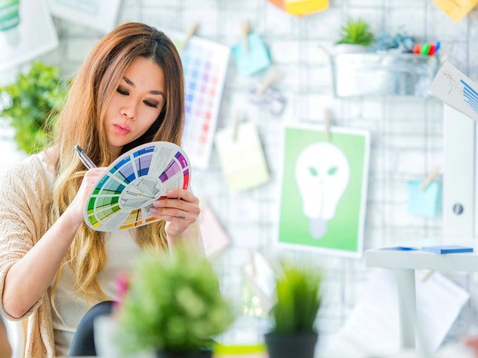
Interested in learning more about color?
Check out some of our other articles on all things color: