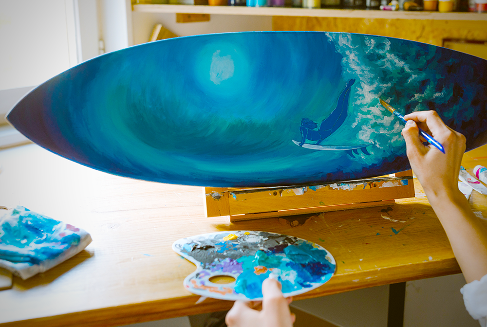
As an artist, understanding color theory is essential to creating pieces that are both aesthetically pleasing and that effectively communicate the intended message.
When you use color theory, there are so many different color palettes you can choose from.
In this article, we'll be discussing five different color theory color schemes you can use in your art: monochromatic, analogous, complementary, warm, and cool.
By the end of this post, you should have a better understanding of modern color theory as well as when and how to use each of these five color schemes in your own work.
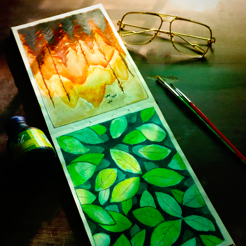
Monochromatic Colors
Monochromatic colors are those that are all from the same hue.
You might think that monochromatic color schemes wouldn't work well, but the key to a successful monochromatic piece is using different values of the same color.
When using a monochromatic color scheme, it's important to vary the tints and shades of the chosen hue to create visual interest.
For example, if you are painting a landscape using only shades of blue, you might use a light blue for the sky, a mid-tone blue for the mountains in the distance, and a dark blue for the shadows cast by the trees.
Differentiating between these values is what gives the art depth and interest.
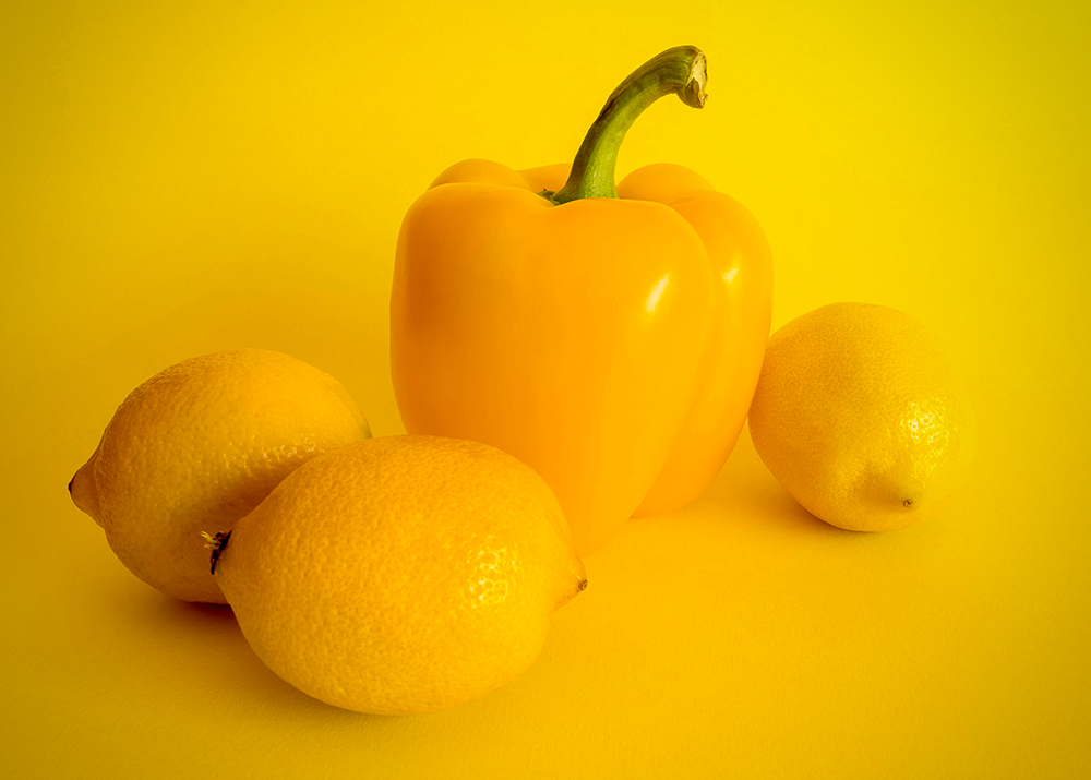

Analogous Colors
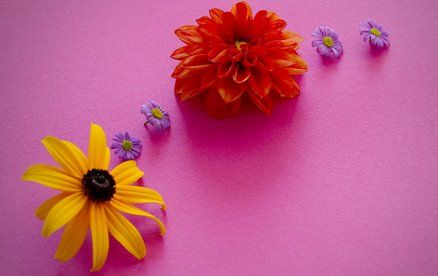
Analogous colors are those that are adjacent to each other on the color wheel.
An example of an analogous color scheme would red, orange, and yellow because they are all adjacent to each other on the wheel.
When using analogous color schemes, most will use two to four colors.
It's important to choose colors that are either all from the same family (e.g., red, orange, and yellow) or that are of similar intensity (e.g., two light colors and two dark colors).
You can also choose one color as an accent color; this will be the pop of color that adds visual interest to your piece.
For example, if you are painting a still life using mostly green and yellow tones, you might add a touch of red as an accent color.

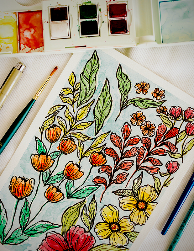
Complementary Colors
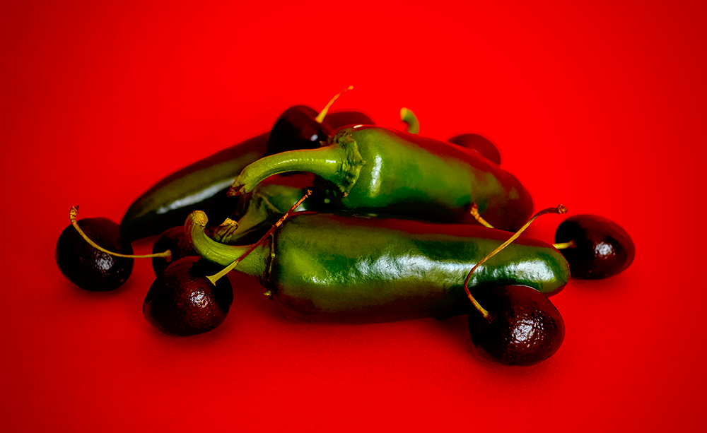
Complementary colors are those that are directly opposite each other on the color wheel.
Each complementary color pair consists of a secondary color and primary color.
One way to remember which colors are complementary colors is to pick a color.
If you chose a secondary color, such as purple, think about which primary colors create the secondary color.
In this example it would be red and blue.
All three primary colors are used in the complementary pairs, so that means that yellow goes with purple; if you look at a color wheel, you'll find yellow directly across from purple.
The complementary pairs include red with green, blue with orange, and yellow with purple.
Using a complementary color scheme is a great way to add contrast to your art.
You can choose one of the complementary hues to act as the dominant color.
You can also use a split complementary color scheme in your art.

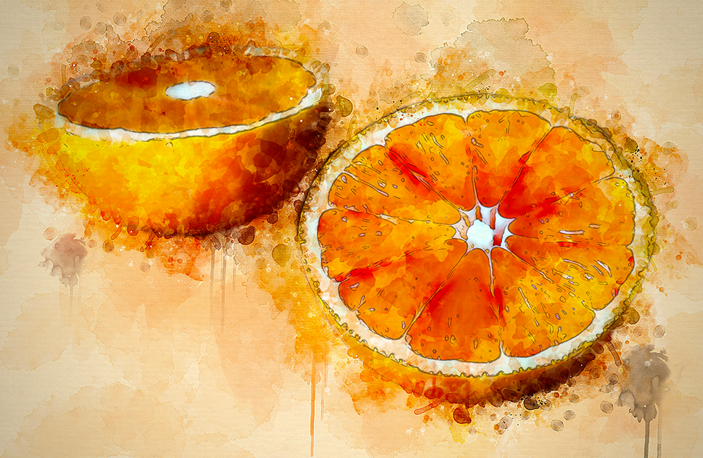
Warm Colors
Warm colors are hues that evoke feelings of warmth and happiness.
These colors tend to be vibrant and can be very eye-catching.
Common warm colors include red, orange, and yellow, but warm colors also include any variant of these main three hues.
For example, pink would be considered a warm color because it is made by adding white to red.


Cool Colors
Cool colors are those that evoke feelings of calm and serenity.
These colors tend to be soft and subdued.
Common cool colors include blue, green, and purple.
You can use other cool colors, such as blue-green or blue-violet, too, or create any tint or shade by mixing white and black.
Cool colors often work well together, and you can also pair cool colors with neutrals like brown or black.


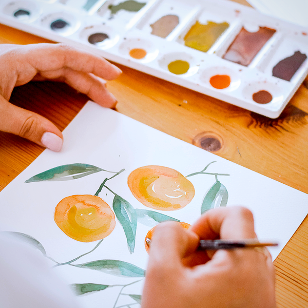
Using Color in Your Art
Color theory is a vital part of creating artwork that is both aesthetically pleasing and effective in conveying the artist's intended message.
Now that you know more about monochromatic, analogous, complementary, warm, and cool colors schemes, it's time to put this knowledge into practice!
Experiment with different combinations of hues, tones, and shades to see what kinds of results you get.
Don't be afraid to step outside of your comfort zone—sometimes the best art comes from taking risks!
Grab some markers, colored pencils, crayons, oil pastels, watercolors, or media of choice and nail that color scheme!
Embrace your unique spark of artistic expression and stay creative!


If you want to learn more about these color schemes and then some, check out HelloArtsy's video!
Yearning to learn more about color?
Check out some of our other guides on all things color; you can learn about the color wheel with tertiary colors, primary and secondary colors, and you can learn about different color combinations you can use for your color palette with our article on color schemes.