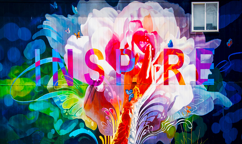
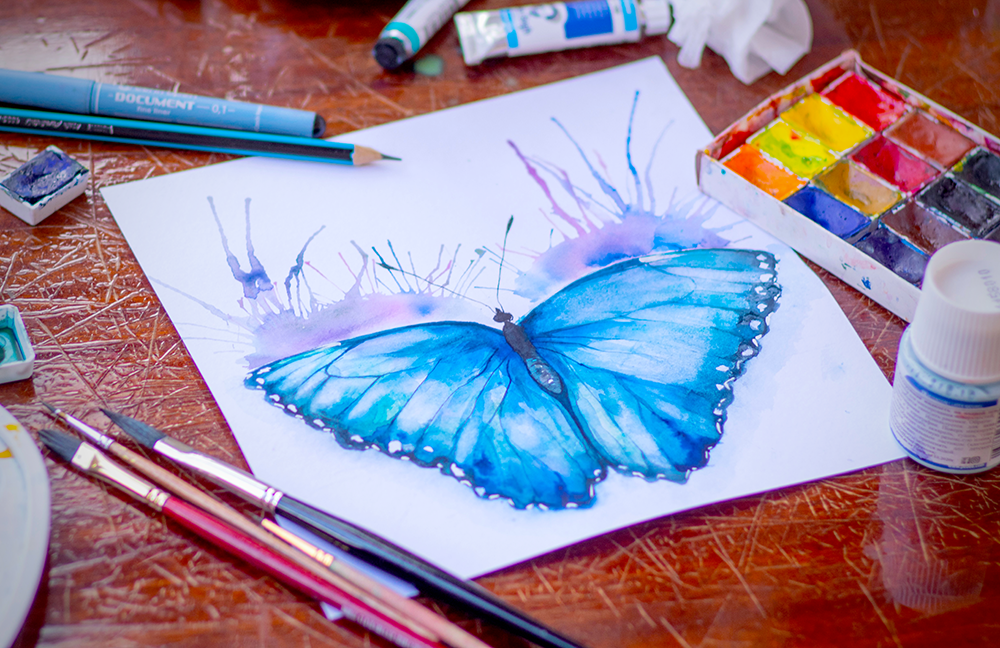
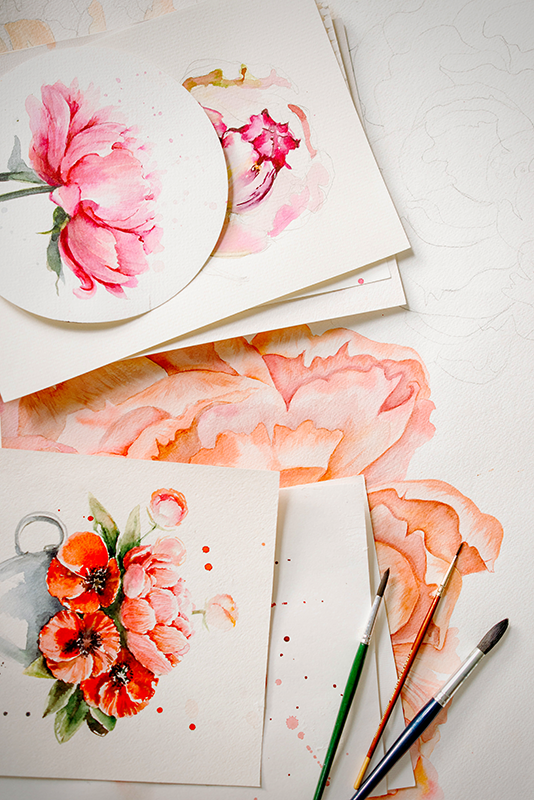
As an artist, one of the most important decisions you can make is choosing the right color scheme for your artwork.
The colors you choose will set the tone and mood for your piece and can ultimately make or break your piece.
In this article we'll give you some tips on how to choose the perfect color scheme for your next art project.

Define the Mood You Want to Create
The first step in choosing a color scheme is to define the mood you want to create with your art.
Do you want your piece to be calming and serene?
Vibrant and energetic?
Playful and lighthearted?
The colors you choose should reflect the mood you want to convey.
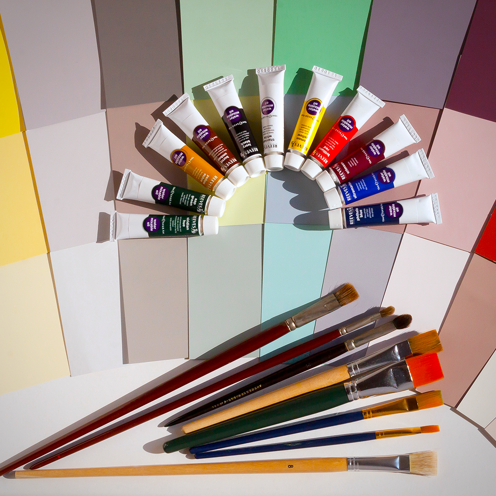
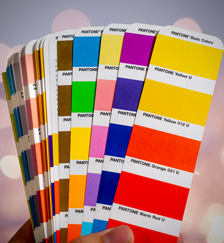
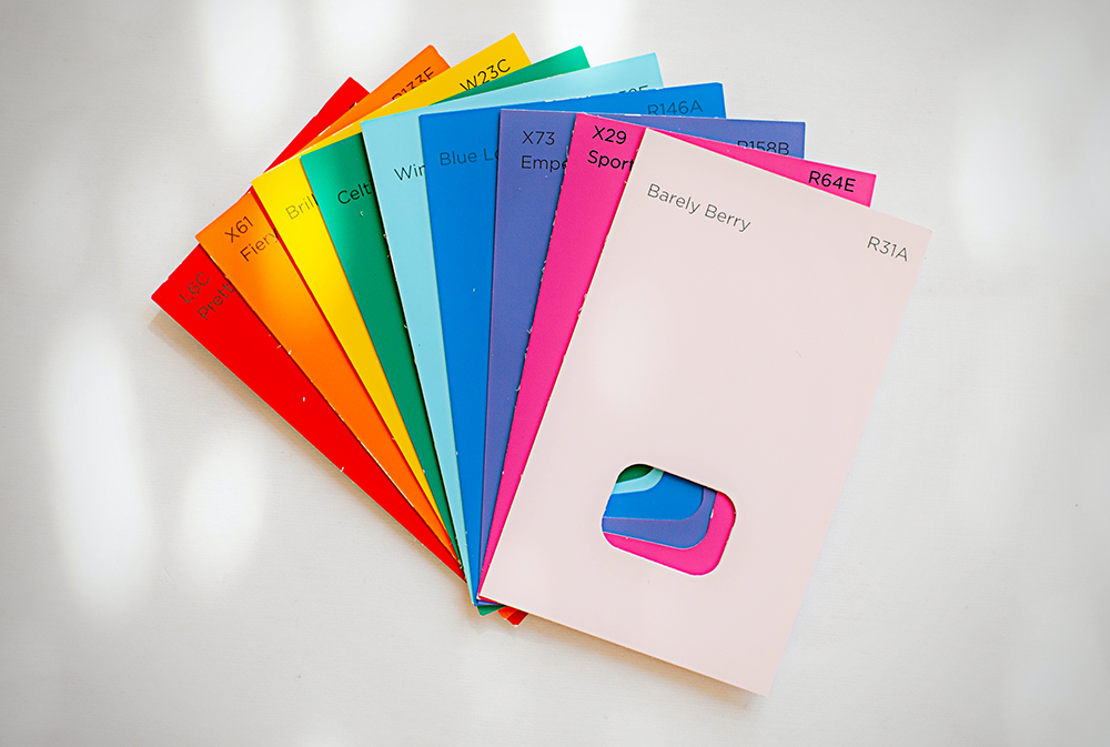
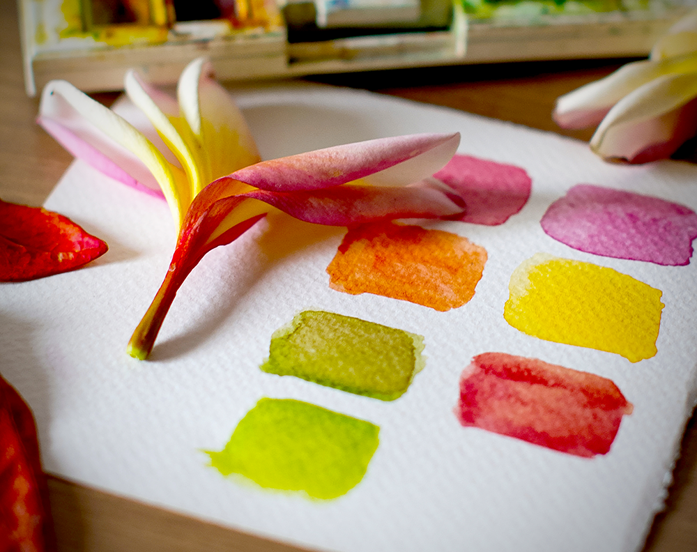
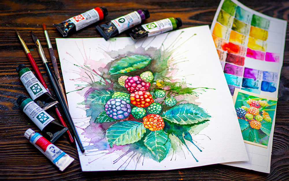
Choose a Color Palette
Once you've defined the mood for your piece, it's time to start narrowing down your color choices.
We recommend choosing a limited palette of 2-5 colors.
This may seem like a small number, but trust us, less can be more when it comes to creating a cohesive color scheme.
Using too many colors can make your artwork look busy and cluttered.

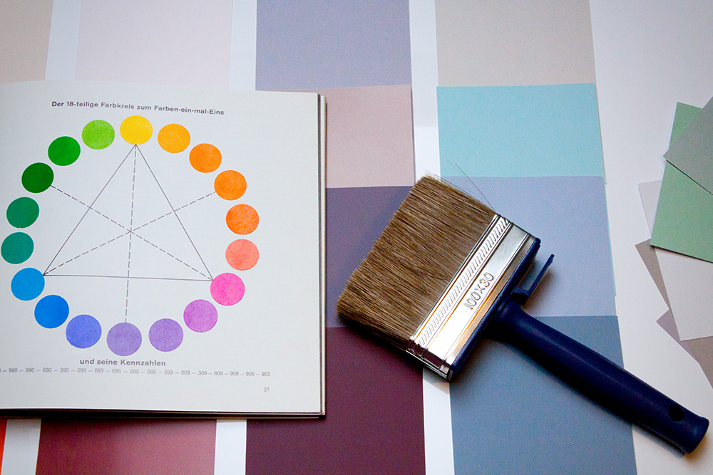
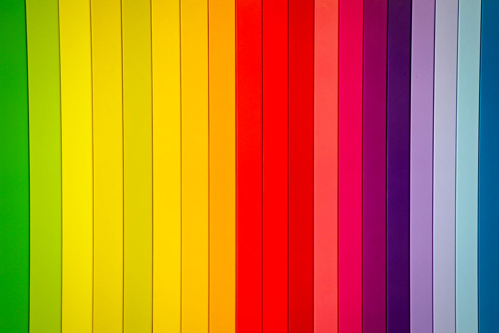
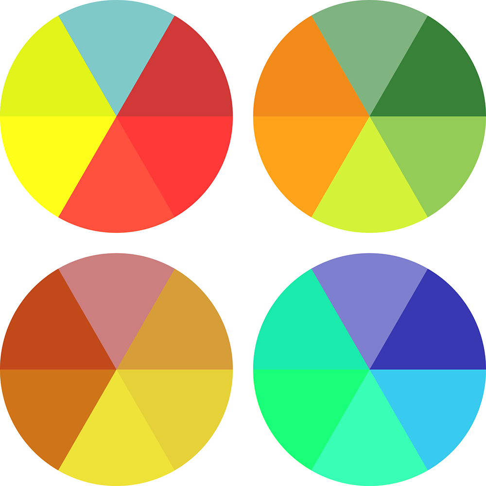
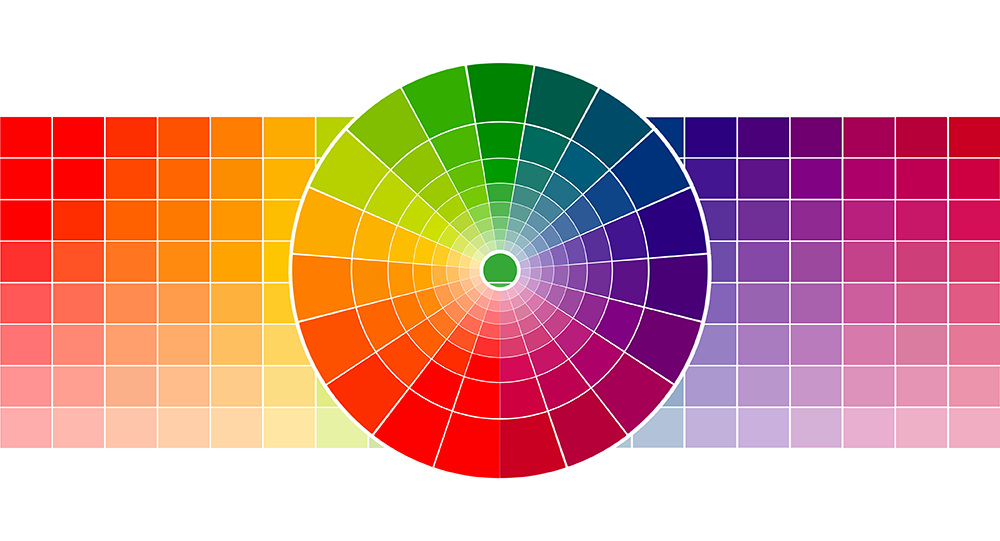
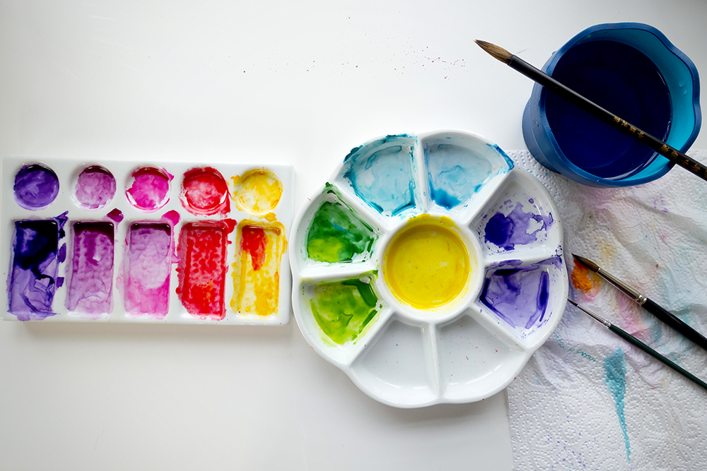
Pick Harmonious Colors
When selecting colors from your palette, be sure to choose colors that complement each other.
You can do this by choosing colors that are opposite each other on the color wheel or even by creating a monochromatic scheme using different shades of one hue.
An analogous color scheme, which uses colors that are next to each other on the color wheel, can also be very effective.
Consider Value and Saturation
In addition to choosing colors that complement each other, it's also important to consider value and saturation.
Value is the lightness or darkness whereas the saturation is the intensity of the color.
Choosing colors with high contrast will help create depth and interest in your artwork, while muted colors will give it a more calming effect.
Nailing Your Color Scheme
Hopefully these tips will help you narrow down your color choices and create a stunning piece of art!
How you implement color can create movement, contrast, emphasis, and unity in your artwork, so don't be afraid to experiment until you find the perfect scheme for your project.
When it comes to choosing a color scheme, less can be more.
A limited palette of 2-5 colors can be all you need to create a beautiful, cohesive work of art.
Last but not least, have fun with it!
After all, art is all about expression and creativity.
So, go forth and experiment with different color combinations until you find the perfect scheme for your next project.

Want to dive deeper? Learn more about color theory with Paintcrush with Kristy Rice's video!
Want to see what can be accomplished with the primary colors? Check out Kirsty Partridge's video!

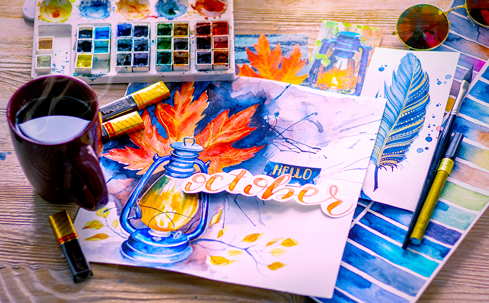
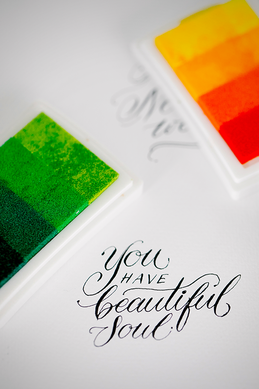
Grab your favorite crayons, oil pastels, colored pencils, markers, watercolors, or media of choice and nail that color scheme!


Check out some of our other guides on all things color; you can learn about the color wheel with tertiary colors, primary and secondary.
Additionally, you can learn about different color combinations and color schemes you can use, such as warm colors, complementary colors, monochromatic using tints and shades of hue (i.e. light blue, dark blue, royal blue, etc.) and more.