A New Creative Adventure
There's something exciting about trying an art medium for the first time.
A whole new collection of techniques, materials, and creative possibilities suddenly becomes available to explore.
And, of course, there's always that wonderful question: what happens if I try this?
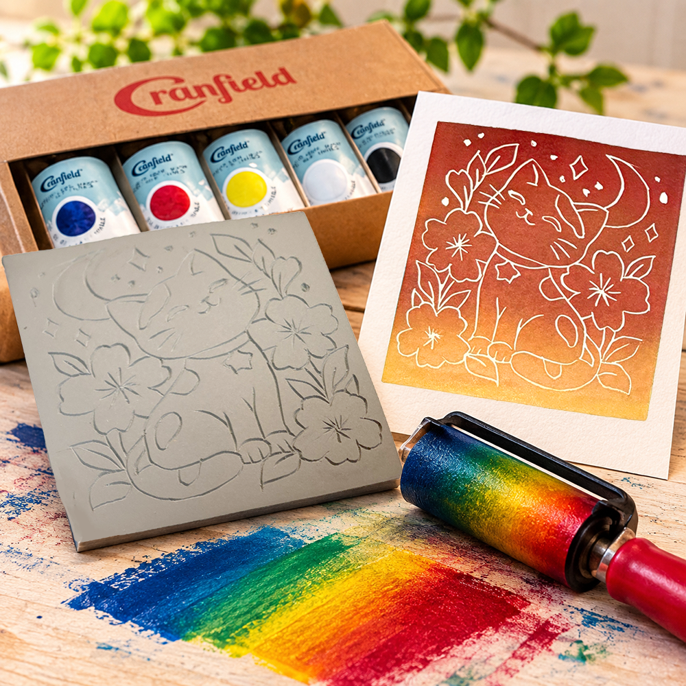
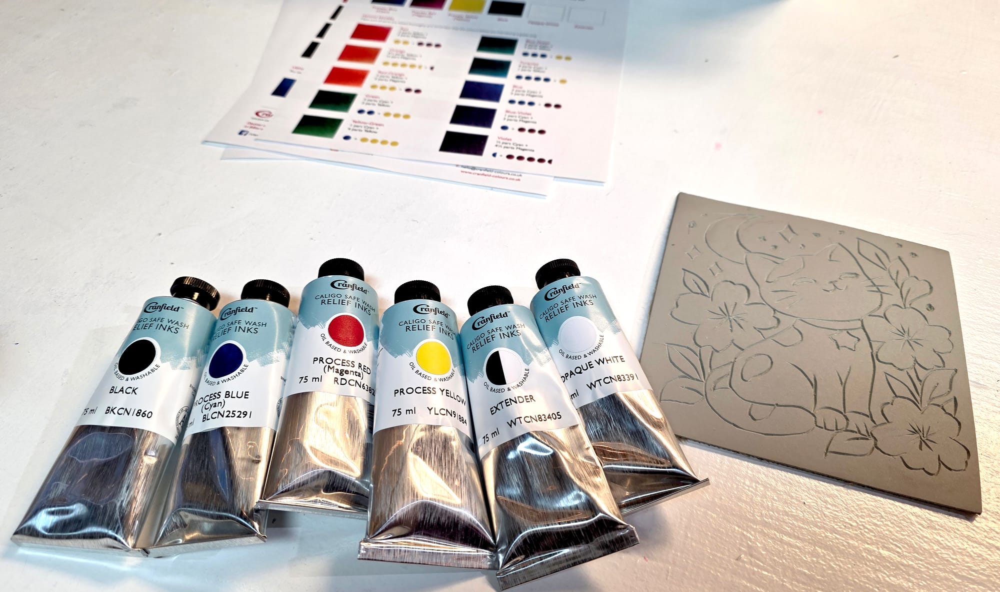
Recently, I had an opportunity to find out when Cranfield Colours generously sent me a selection of their Caligo Safe Wash Relief Inks, along with color-mixing guides filled with possibilities for creating different shades and combinations.
There was just one little detail.
I'd never tried printmaking before!
I've experimented with plenty of artistic mediums over the years, but linocut printmaking was something I hadn't explored yet.
Fortunately, my weekly art club at Marnie's Creative Outlet provided the perfect opportunity to give it a try.
The previous week, Marnie, who hosts our art club, gave me a piece of linoleum and encouraged me to come up with a design to carve.
Naturally, I decided to make something cute.
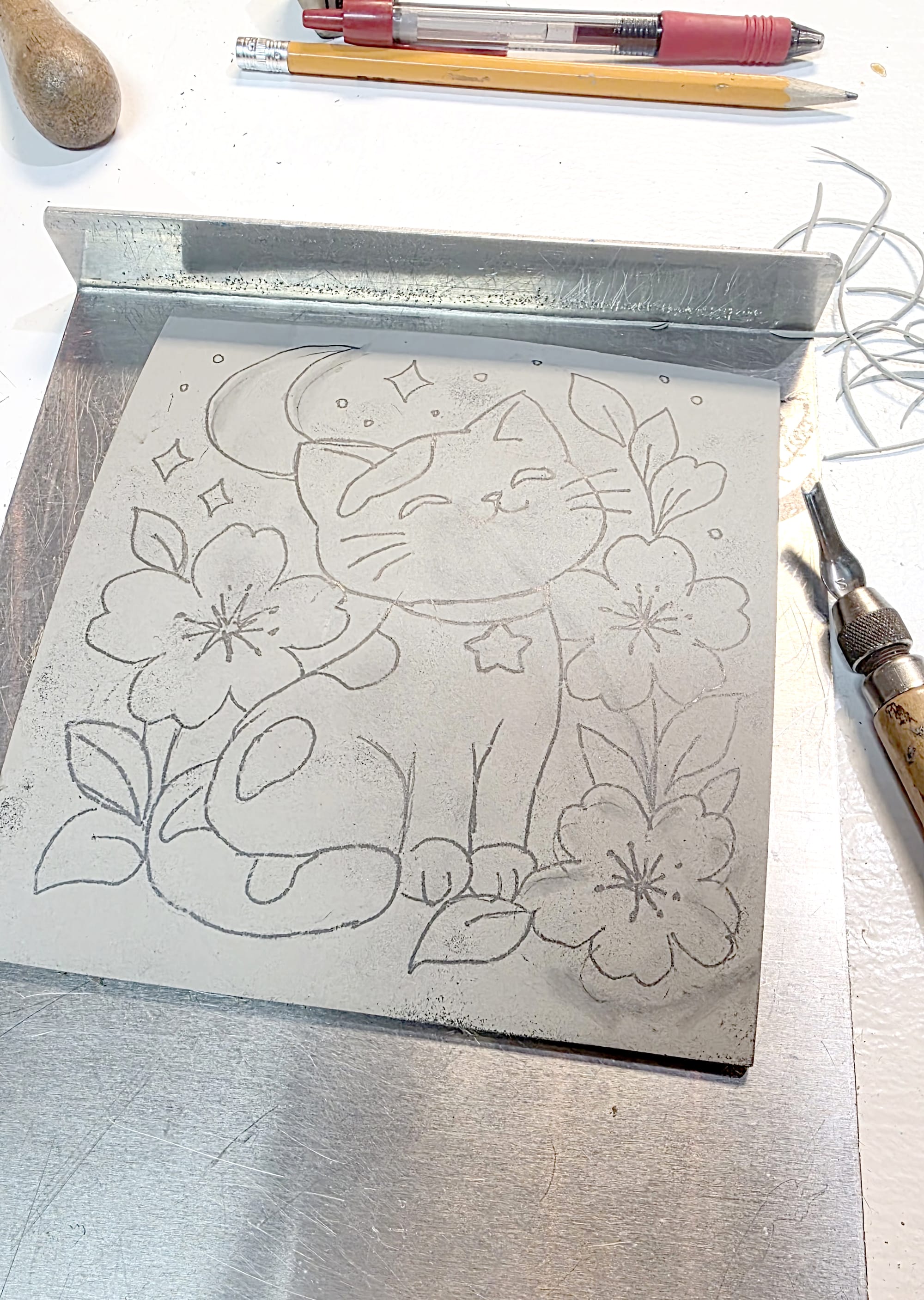
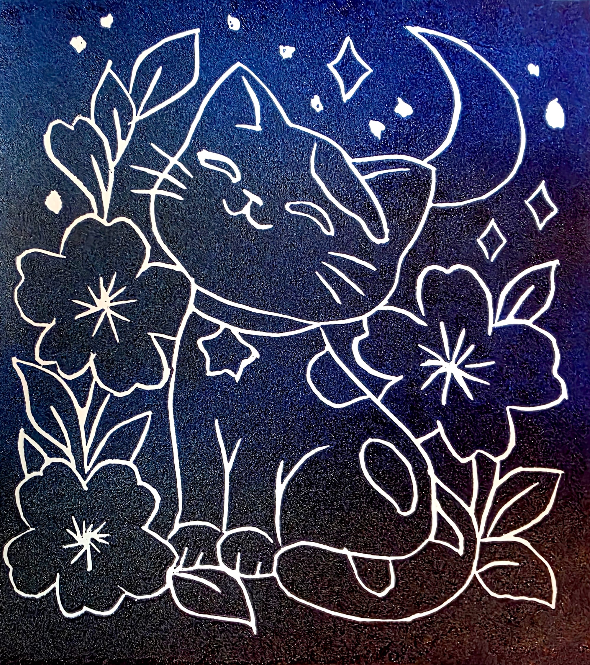
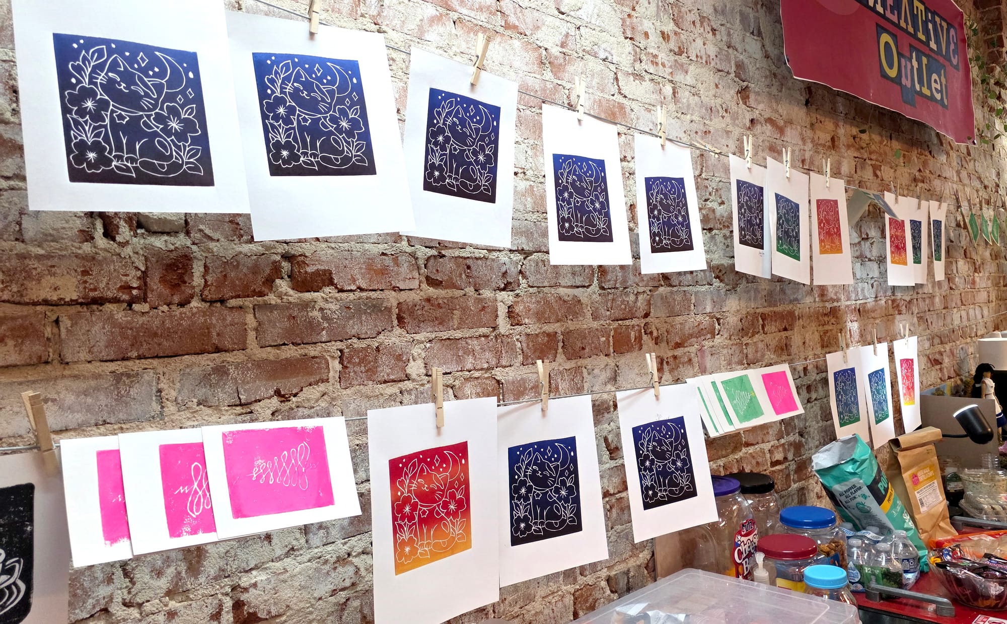
My design featured a cheerful cat surrounded by flowers, with a crescent moon and little stars decorating the background.
After spending time carving the design into the linoleum, I was eager to see how it would look as a print.
When I returned to art club with my new inks, Marnie mentioned a few different approaches I could try.
I could start with a single, solid color or experiment with blending colors into a gradient.
Well, gradients sounded fun!
Apparently, she was a little surprised that I wanted to jump straight into gradients for my very first printmaking experiment, but why not?
One of my favorite things about creating art is discovering what happens when I move beyond the most straightforward approach.
Sometimes that means trying an unfamiliar material.
Other times, it means taking a familiar idea and approaching it from a completely different direction.
And sometimes, it means deciding that two colors sound more interesting than one before I've even made my first print.
What began as an opportunity to experiment with some beautiful new inks soon became an evening of colorful discoveries, conversations about the difference quality materials can make, and an unexpected idea for bringing our art club together through a future print exchange.
So, for this Materials Lab experiment, I'm exploring a new question: what happens when I combine a technique I've never tried before with a little curiosity, some colorful inks, and a willingness to experiment?
Let's find out!
Materials Lab Notes: What I'm Working With
Before getting into the experiments, here's a closer look at the materials I've been working with.
The Materials
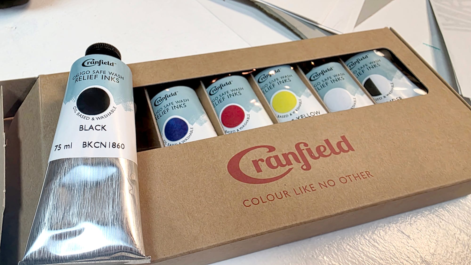
Cranfield Caligo Safe Wash Relief Inks
Cranfield Colours generously provided a selection of their Caligo Safe Wash Relief Inks, which are oil-based printmaking inks formulated to be cleaned up without traditional solvents.
One thing that immediately caught my attention was the combination of oil-based ink and relatively easy cleanup.
Those aren't necessarily qualities I'd expect to find together!
The inks came in several colors, giving me plenty of opportunities to experiment with different combinations.
Cranfield Color-Mixing Guides
Along with the inks, Cranfield sent two helpful resources:
- Colour Mixing Guide by Weight: A guide for mixing different colors using measured proportions.
- Colour Mixing Guide by Parts: A guide featuring color combinations and suggested mixing ratios.
I appreciate having these resources because they provide a starting point for exploring colors I might not think to mix on my own.
I haven't worked through all the combinations yet, but I'm already curious about what I could create with them.
Linoleum Block and Carving Tools
Marnie provided the linoleum block for my first design, and I used carving tools to remove the areas I didn't want to print.
Unlike drawing directly onto paper, relief printmaking involves thinking about which parts of the design will hold ink and which areas will remain unprinted.
Although this was my first experience with linocut printmaking, the underlying idea wasn't entirely unfamiliar.
During student teaching, I'd experimented with a simple version of relief printing by carving an eraser with a sharpened pencil and applying ink with markers.
Working with an actual linoleum block, carving tools, and relief printing inks was a different experience, though, and I was excited to explore what the process could offer.
Brayer and Printing Paper
A brayer, which is a small roller used in printmaking, helps distribute ink across the raised surface of the carved block.
Paper then becomes the surface that receives the printed image.
For these first experiments, I've been working with paper, but I'm already wondering what might happen if I tried printing onto other materials.
The Experiments So Far
At this stage, I've:
- Designed and carved my first linocut, featuring a cat surrounded by flowers, stars, and a crescent moon.
- Experimented with Cranfield's relief inks at art club.
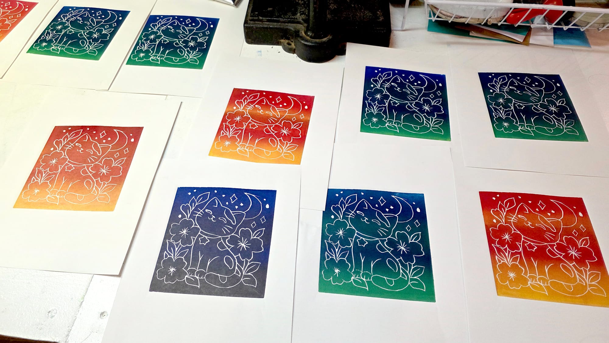
- Created three gradient variations of the same design, using two ink colors for each variation.
- Observed how the inks behaved during printing and cleanup.
- Started considering other color combinations, designs, and surfaces for future experiments.
This is still very much a learning process, and I haven't explored everything these materials can do.
But that's part of the fun!
A Note About the Materials
The Cranfield Caligo Safe Wash Relief Inks and color-mixing guides featured in this experiment were generously provided by Cranfield Colours at no cost. My observations and experiences are my own, and receiving these materials does not guarantee a positive review.
This article documents my personal experimentation rather than serving as a comprehensive technical review or printmaking tutorial.
Experiment #1: Designing and Carving My First Linocut
Before I could start experimenting with Cranfield's inks, I needed something to print!
Fortunately, Marnie, who hosts our weekly art club at Marnie's Creative Outlet, provided me with a piece of linoleum and encouraged me to come up with a design.
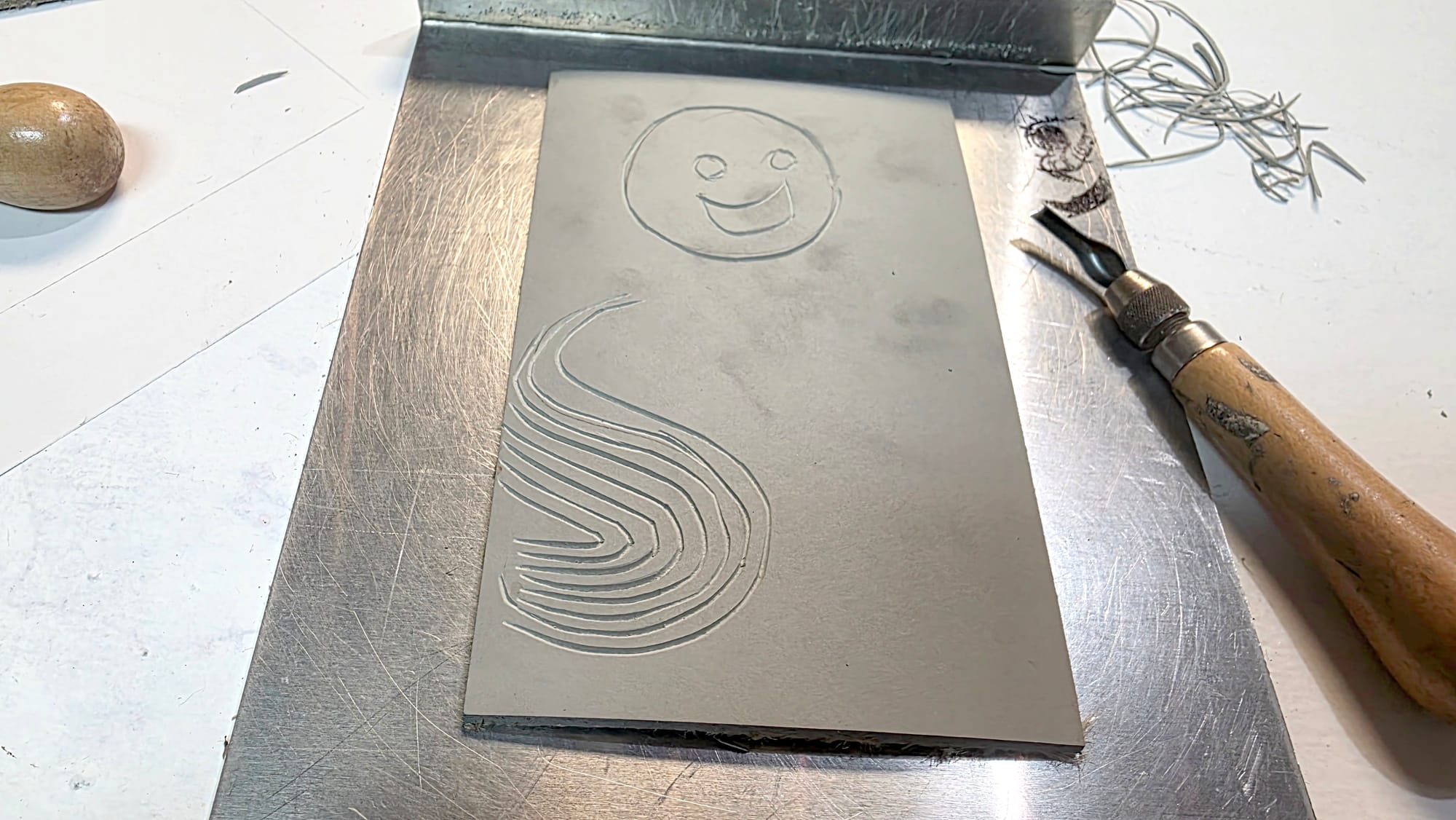
She encouraged me to work on a test piece to get used to the carving tools, which I did.
Since this was my first time trying linocut printmaking, I wanted to create something that would be fun to work with.
And, naturally, I decided on a cat (I've always been drawn to cats, what can I say)!
A Little Cat Among the Flowers
My design features a cheerful, sleepy-looking cat surrounded by flowers and leaves, with a crescent moon, stars, and little sparkles decorating the background.
I wanted something cute and whimsical, with enough detail to make the finished prints interesting.
The flowers and leaves create a decorative frame around the cat, while the moon and stars add a slightly dreamy atmosphere.
It's the kind of playful illustration I enjoy creating, but this time, instead of drawing it directly onto paper, I needed to translate it into a carved surface.
That introduced an entirely different way of thinking about the design.
Drawing by Taking Something Away
One of the interesting things about linocut printmaking is that the image is created through a subtractive process.
Rather than adding lines and colors directly to a surface, I used carving tools to remove parts of the linoleum.
The areas left raised can receive ink, while the recessed areas generally remain unprinted.
For my design, I carved around the cat, flowers, leaves, moon, and other decorative details to create the lines that would eventually appear in the prints.
It was interesting to think about an illustration in terms of what needed to be removed rather than what needed to be added.
And unlike drawing, where I can simply make another mark or add another layer, carving involves physically changing the surface.
Once an area has been carved away, you can't just put it back!
That makes the process feel different from many of the other techniques I've explored.
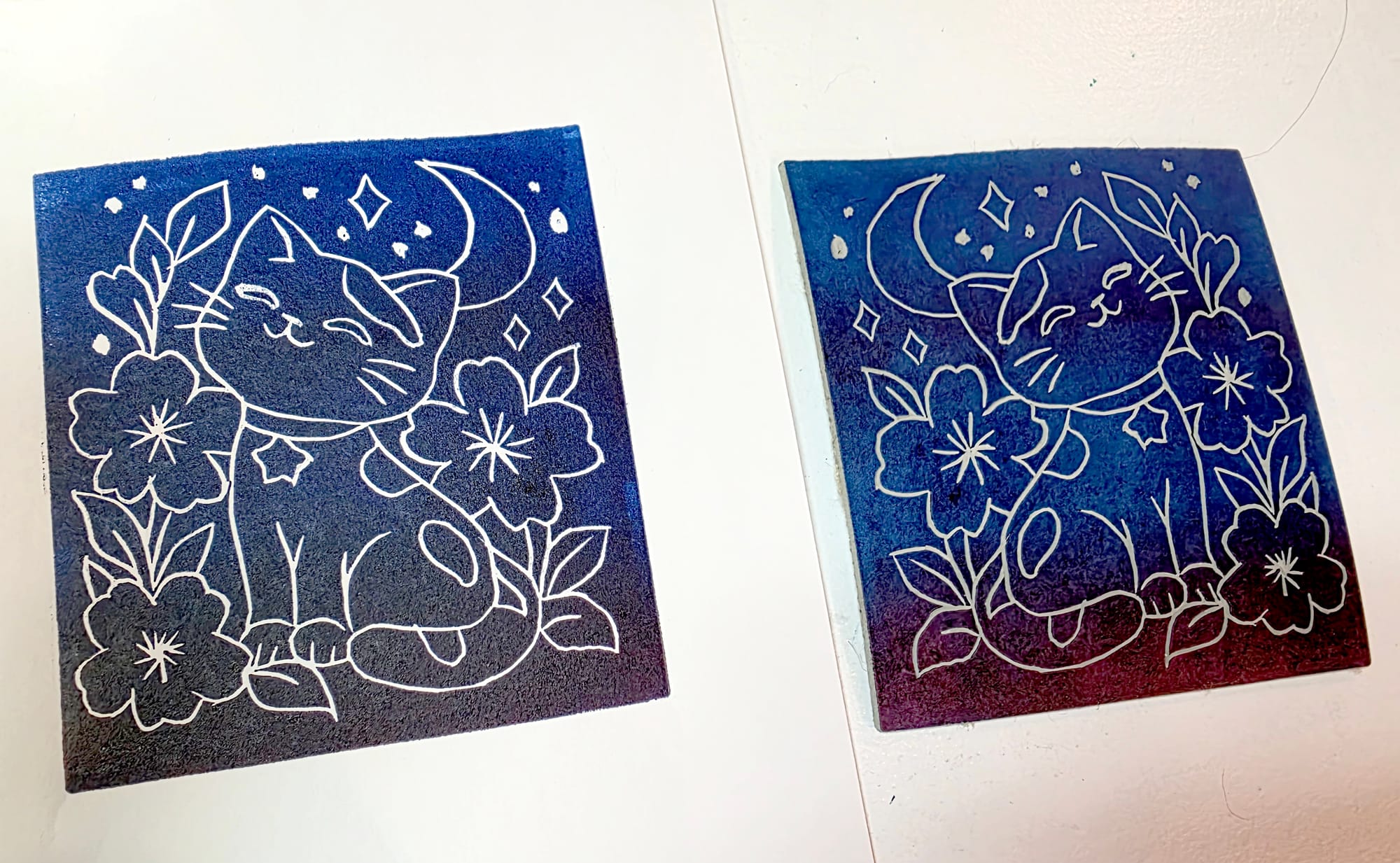
Marnie also pointed out something interesting about my approach: I was creating an inverse design, with the outlines of the image remaining white rather than being printed in ink.
Instead of carving away the background and leaving the outlines raised, I was carving the lines themselves into the linoleum.
When the raised areas received ink, those recessed lines would remain unprinted, revealing the color of the paper underneath.
I liked how this approach allowed the cat, flowers, and other details to stand out against the colorful background.
It also ultimately gave me larger areas of the block where I could experiment with gradients.
From Carved Lines to Printed Artwork
After working on the design during art club, I had a carved linoleum block ready for its first experiment with ink.
At that point, I could see the design in the block itself, but I hadn't yet seen how it would translate into a finished print.
- Would the smaller details show up clearly?
- How would the carved lines look once ink was applied?
- What would happen when I started introducing different colors?
Those were questions I was eager to explore.
One thing I particularly like about printmaking is that a single carved design can become the starting point for multiple artworks.
The block stays essentially the same, but the colors, ink application, and printing process can change the appearance of each impression.
That possibility was especially appealing to me.
After all, why stop at one version when there are so many different combinations to explore?
And with my first linocut ready, it was finally time to find out what Cranfield's inks could do!
Experiment #2: Going Straight for the Gradients
With my first linocut carved and ready, it was finally time to experiment with Cranfield's inks!
At our next art club gathering, I brought along the inks Cranfield had generously provided, eager to see how my little cat design would translate into a print.
Marnie mentioned a couple of different approaches I could try.
I could start with a single, solid color, which would give me an opportunity to see how the ink transferred from the block to the paper.
Or I could experiment with gradients, blending different colors together to create a transition across the image.
Well, that second option sounded much more interesting!
Gradients it was!
Marnie seemed a little surprised that I wanted to jump straight into experimenting with gradients for my very first printmaking experience.
But I figured, why not?
If I'm going to explore something new, I might as well have some fun with it!
Plus, even though the image design of the linocut was remaining the same each time, creating a gradient makes each print an unique, one-of-a-kind piece; even with the same colors being used, no two would be identical.
One Design, Different Possibilities
One of the things I find fascinating about printmaking is that the same carved block can produce artwork with very different appearances.
The design itself doesn't have to change.
Instead, I can experiment with how the ink is applied, which colors I choose, and how those colors interact.
For my first attempts, I decided to keep things relatively simple by using two colors of ink for each gradient.
That gave me an opportunity to explore color transitions without introducing too many variables at once.
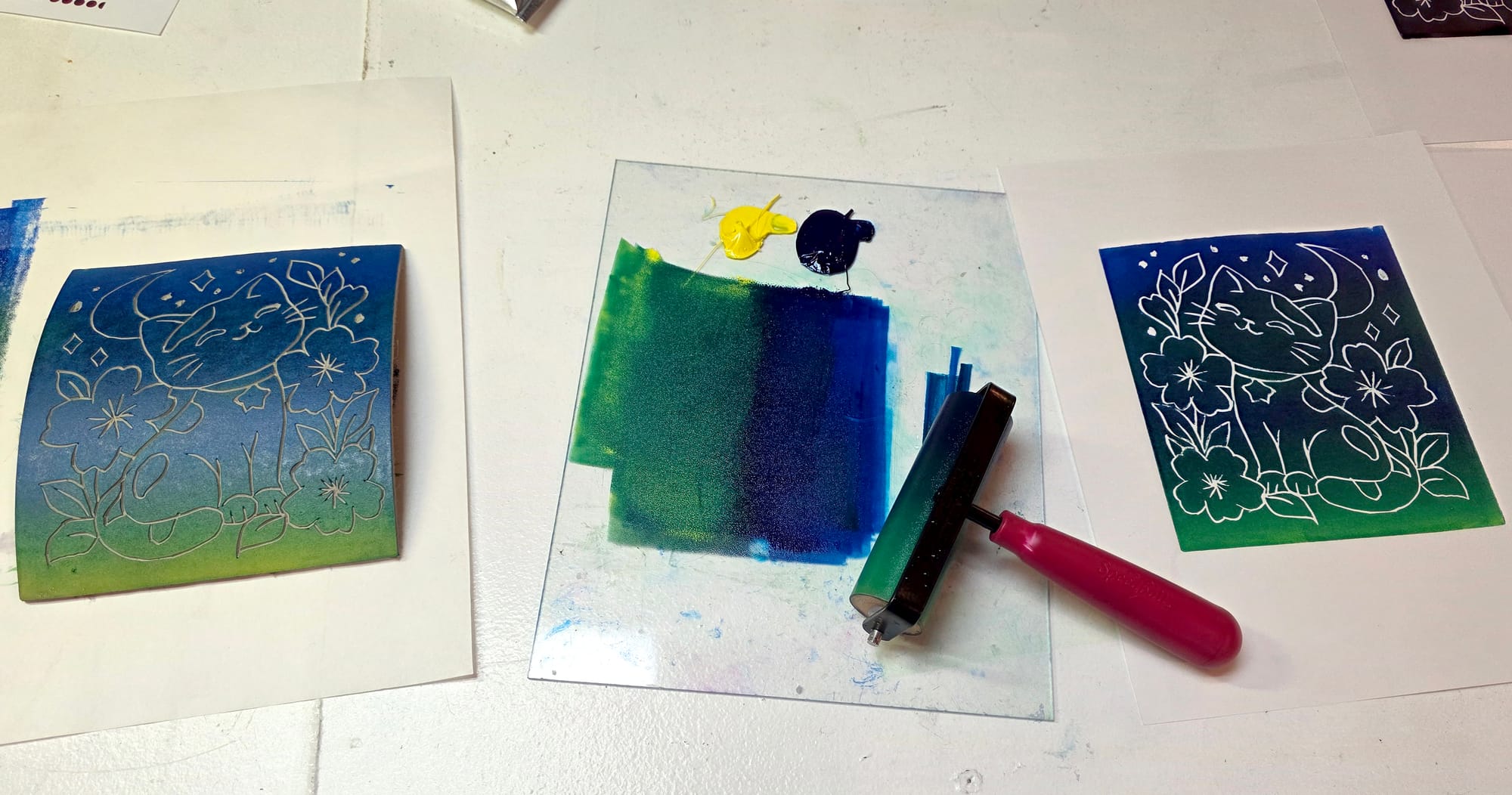
Using a brayer, I worked with the inks to create a gradient across the raised surface of my linocut.
But applying the ink was only part of the process; I still needed to transfer the design onto paper!
Marnie showed me how to use a printing press to apply pressure.
The press had a metal plate that moved through the machine as I turned a crank, along with a fabric flap that helped cover the materials during printing.
After positioning the linocut and paper, I used the crank to move everything through the press, allowing the pressure to transfer the inked design onto the paper.
And then came the exciting part: the big reveal!
Once everything had passed through the press, I carefully peeled the paper away from the linoleum to see the finished print.
There's something particularly satisfying about that moment.
Even though I'd already spent time designing and carving the linoleum, seeing the cat surrounded by flowers, stars, and a crescent moon appear on paper was a different experience entirely.
And because I was experimenting with gradients, I also got to see how the colors had transferred and blended across the image.
It was exciting to finally see my little cat design come to life as a print!
Three Variations, Three Different Looks
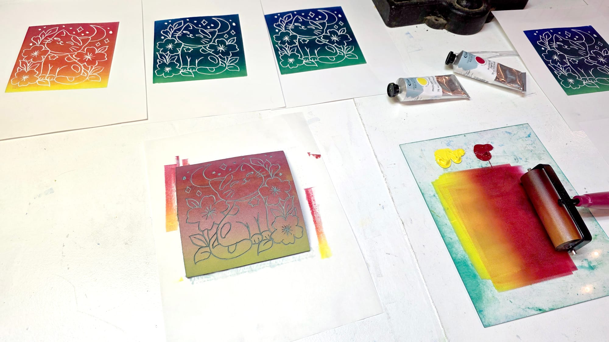
So far, I've created three gradient variations using the same carved block.
Each one uses two ink colors, but the resulting color combinations give the design a different appearance.
For these first experiments, I created three different color combinations:
- Red and blue: A dramatic combination that reminded me of a colorful night sky.
- Blue and yellow: A combination that introduced green tones where the colors blended, creating a different atmosphere.
- Yellow and red: A warmer combination that brought out orange tones as the colors transitioned into one another.
I particularly enjoyed seeing how the colors interacted.
The transitions weren't simply a matter of placing two separate colors beside one another; the areas where they blended introduced additional shades and variations.
And because I was applying the gradients by hand, each impression had its own character; even if I used the same colors again, the exact placement and blending wouldn't necessarily be identical.
That means the same carved block can produce a whole collection of prints that are related without being exact duplicates!
And I love how those changes influence the overall feeling of the artwork!
The cat, flowers, and moon remain the same, but the background colors create different visual experiences.
It's a wonderful example of how changing one aspect of the creative process can open up several possibilities.
Rather than carving a completely new design each time, I can continue experimenting with the same block and discover how different ink combinations affect the finished prints.
And since these were my very first attempts, I find that especially exciting.
What I've Noticed So Far
One of my biggest takeaways from this experiment is just how much variety a single linocut can offer.
I started with one carved design, but experimenting with the inks allowed me to create multiple versions without needing to begin the carving process again.
I also discovered that I really enjoy working with gradients!
There's something appealing about watching colors transition across an image rather than filling the entire surface with a single shade.
And now I'm curious about what might happen if I take things further.
- What if I tried three colors instead of two?
- What about different combinations of warm and cool colors?
- Could I create a gradient that moves through several colors, almost like a rainbow?
Those are experiments I'd love to explore in the future.
For now, though, I'm delighted that my first printmaking experience has already given me three colorful variations of my little cat design, and I'm certainly not finished experimenting with it yet!
Getting to Know Cranfield's Inks
One of the things I particularly enjoyed about this experiment was getting to work with Cranfield's Caligo Safe Wash Relief Inks for the first time.
Since I was completely new to printmaking, I didn't have much personal experience with other printmaking inks to compare them against.
But I wasn't the only person interested in seeing how they performed!
As I started experimenting at art club, the inks attracted quite a bit of attention.
And the reactions were rather enthusiastic!
When Quality Materials Make an Impression
Everyone seemed impressed by the quality of the inks Cranfield had provided.
One of our art club members, Joe, has been doing quite a bit of printmaking, so he had more experience with the medium than I did, and he seemed especially interested in the inks!
In fact, I got the impression that he was a little wistfully jealous of the opportunity to work with such lovely materials.
It was a bit amusing, especially since I was just getting started with printmaking myself!
Marnie also brought up an interesting point about the differences between art materials.
Sometimes, people assume that materials within the same general category are more or less interchangeable.
After all, paint is paint, right?
But as Marnie pointed out, there's a difference between working with acrylics and oils, just as there can be meaningful differences between materials of varying quality.
And sometimes, those differences become much more apparent once we actually start using them.
Things like consistency, pigment quality, coverage, and how a material behaves during application can all influence the creative experience.
Of course, that doesn't mean expensive materials are automatically better for every purpose, or that more affordable supplies can't produce wonderful artwork.
Different materials have different strengths, and what works best can depend on the artist, the technique, and the desired result.
But it was interesting seeing how much excitement these particular inks generated among people who had more experience with printmaking than I did.
It certainly made me appreciate the opportunity Cranfield had given me!
 Jessica Carey
Oil-Based Inks That Wash Up?
Another thing that caught our attention was the cleanup.
Cranfield's Caligo Safe Wash Relief Inks are oil-based, but they're formulated to be cleaned up without relying on traditional solvents.
And that combination was especially interesting to Marnie.
Oil-based materials aren't necessarily what people associate with easy cleanup, so she was impressed by the idea of an oil-based printing ink that could be washed away relatively easily.
And when it came time to clean up after my experiments, I was pleasantly surprised!
The inks cleaned up quite easily during our session, using nothing more complicated than dish soap and a sponge.
That was one of the most pleasant surprises of the evening.
Despite being oil-based, the inks didn't require me to bring out traditional solvents for cleanup.
I was able to use ordinary dish soap and a sponge to clean up after experimenting with my different color combinations.
It's especially convenient when experimenting with multiple colors, since cleanup is an inevitable part of switching between mixtures and finishing up a session.
After all, I enjoy making art, but spending an excessive amount of time cleaning everything afterward?
Not quite as exciting!
Of course, easy cleanup doesn't mean that every surface, tool, or stain will behave identically, and it's still important to follow the manufacturer's cleaning instructions.
But based on this first experience, the cleanup was much more manageable than I might have expected from an oil-based ink, and that's something I definitely appreciate.
First Impressions, Not Final Conclusions
Something I want to emphasize is that these are still my first impressions.
I've only just started exploring linocut printmaking, and I haven't conducted side-by-side comparisons with other relief inks.
So while I was pleased with my results, and the more experienced artists at art club were enthusiastic about the inks, I'm not going to claim that I've determined which brand or formulation is objectively best.
That's not really the purpose of this experiment.
What I can say is that I enjoyed working with Cranfield's inks, appreciated the color possibilities they offered, and found the cleanup surprisingly straightforward.
And seeing the excitement they generated among the other art club members made the experience even more enjoyable.
Especially because their enthusiasm led to another idea: what if everyone had an opportunity to experiment with them, too?
But I'll come back to that in a little bit!
First, there's another part of Cranfield's generous package that I want to explore: the color-mixing guides.
The Color-Mixing Possibilities
As much as I enjoyed experimenting with gradients, there's another part of Cranfield's generous package that has me excited about future possibilities.
The color-mixing guides!
Along with the Caligo Safe Wash Relief Inks, Cranfield provided two guides filled with information about creating different colors.
And if there's one thing I enjoy, it's discovering how much variety can come from a relatively small collection of materials.
After all, having a particular color of ink doesn't mean I'm limited to using that color straight from the tube.
- What happens when I start mixing them together?
- How many different shades could I create?
- How might those new colors change the appearance of my prints?
Those are questions I'm looking forward to exploring!
Two Different Ways to Explore Color
Cranfield provided two resources: a Colour Mixing Guide by Weight and a Colour Mixing Guide by Parts.
Both offer ways to approach color mixing, but they present the information a little differently.
The Colour Mixing Guide by Weight includes a color wheel featuring 21 suggested hues, with proportions for mixing cyan, magenta, and yellow inks by weight.
I find this particularly interesting because it demonstrates how a relatively small selection of colors can be combined to create a much broader range.
Rather than relying entirely on guesswork, I could use the suggested proportions as a starting point and see how closely my mixtures match the examples.
And, of course, I could also experiment with adjusting those proportions to create variations of my own.
The Colour Mixing Guide by Parts offers another approach, using mixing ratios expressed in parts rather than measured weights.
It includes information about combining process colors, as well as incorporating black, opaque white, and extender into different mixtures.
I appreciate having both guides because they provide different ways to approach the same creative challenge.
Sometimes I might want to measure a mixture carefully so I can reproduce a particular shade.
Other times, I might simply want to experiment with proportions and see what happens.
Both approaches have their place in The Materials Lab!
 Jessica Carey
More Than Just Mixing Two Colors
One detail I found especially interesting was the distinction between opaque white and extender.
Although both can change the appearance of an ink mixture, they don't serve exactly the same purpose.
Opaque white can be used to create lighter, more opaque mixtures, while extender can increase transparency.
That opens up another collection of possibilities beyond simply changing the hue.
- What would happen if I experimented with lighter versions of the same colors?
- Could I create softer, more delicate prints using different mixtures?
- How might changes in transparency affect the way a print looks?
These are all things I'd be interested in investigating.
The guides also note that adding white or extender can reduce the overall lightfastness of a mixture, which is an important consideration when creating artwork intended to be displayed over time.
It's a useful reminder that experimenting with materials isn't just about discovering what looks interesting.
It's also about learning how different ingredients and techniques affect the finished artwork.
A Whole Collection of Experiments Waiting to Happen
So far, my printmaking experiments have focused on creating gradients with two ink colors.
I haven't yet worked my way through the color-mixing recipes in Cranfield's guides, but I can already see how useful they could be for future projects.
For example, I could try creating several variations of a particular color and compare how they look when printed.
Or I could explore combinations inspired by the color wheel, using the suggested proportions as a starting point.
I could even create a collection of prints featuring the same linocut design, each using a different mixture.
That would be a fun way to compare the results while keeping the carved design consistent.
And perhaps I'll eventually create a little color reference library of my own, documenting the combinations I try and which ones I particularly enjoy.
Because knowing how to recreate a favorite color would certainly be helpful!
Of course, I'm also interested in combining these ideas with gradients.
I've already experimented with two-color transitions, but what if I mixed some custom shades first and then used those to create gradients or tried blending three or more colors across a single print?
There's so much room to explore!
And that's one of the things I love about experimenting with art materials.
An initial project might begin with a single question, but the process often leads to several more.
In this case, I started by wondering what my first linocut would look like when printed.
Now I'm wondering how many different versions I could create simply by changing the colors.
One carved block, countless possibilities!
When Sharing Materials Inspires More Creativity
One of my favorite things about art club is that creativity doesn't happen in isolation.
Even when we're working on completely different projects, there's always an opportunity to learn from one another, exchange ideas, and discover something new.
And sometimes, one person's experiment inspires an entirely different project!
That's exactly what happened during my first printmaking experience.
Different Artists, Different Projects
While I was experimenting with my little cat linocut and Cranfield's colorful inks, other art club members were working on their own creative projects.
Joe, who has more experience with printmaking than I do, was particularly interested in the inks.
Meanwhile, his wife, Jen, was working on a much larger linocut design featuring a donkey!
It was interesting seeing how differently we approached the same medium.
My little cat was surrounded by flowers, stars, and a crescent moon, while Jen's donkey was an entirely different subject and scale.
And Joe brought experience with printmaking techniques that I was only beginning to explore.
That's something I appreciate about being part of a creative community.
We don't all need to have the same interests, experience levels, or artistic styles to learn from one another.
In fact, those differences often make the experience more interesting!
What Happens When We Share?
As everyone expressed interest in the Cranfield inks, I offered to let the other art club members use them, too.
After all, Cranfield had generously provided me with these materials, and I was excited about the possibilities they offered.
Why not let others experience them as well?
I enjoy experimenting with new materials, but I also love seeing what other people create.
Someone else might approach the same inks with completely different ideas, techniques, or color combinations.
And that could lead to discoveries I might never have considered on my own!
The response was enthusiastic.
Once I offered to share the inks, the conversation quickly expanded beyond my little cat prints.
And before long, everyone was discussing an idea that sounded particularly fun: a holiday print exchange!
An Unexpected Idea for the Holidays
I'd never participated in a print exchange before, so this was an entirely new idea for me, but I was immediately intrigued!
The general concept is that participating artists create prints to exchange with one another, allowing everyone to receive artwork made by other members of the group.
It's a lovely way to share creativity, especially when each person brings a different style and approach to the process.
And I can imagine how much fun it would be to see the variety of designs everyone comes up with!
Some people might create detailed illustrations, while others might experiment with bold shapes, patterns, or playful subjects.
There could be traditional designs, whimsical characters, nature-inspired artwork, or something completely unexpected.
The possibilities are practically endless.
Since we were discussing a holiday exchange, it could also become a wonderful way to celebrate the season together.
Nothing has been finalized yet, but I love that the idea emerged so naturally from everyone getting excited about the inks.
What started as my first experiment with printmaking suddenly had the potential to become a shared creative experience, and that's something I find especially meaningful.
Creativity Has a Way of Spreading
I've always appreciated how sharing art materials can open doors for other people.
Sometimes, someone simply needs an opportunity to try something unfamiliar.
Other times, seeing another artist experiment with a material can spark an idea they hadn't considered before.
 Jessica Carey
And sometimes, an offer to share a few tubes of ink can turn into a conversation about organizing an entire print exchange!
I think that's one of the wonderful things about creative communities.
Knowledge, materials, encouragement, and inspiration can move between people rather than remaining confined to individual projects.
One person brings a material.
Another brings experience.
Someone else suggests an idea.
And suddenly, there are new possibilities for everyone.
Of course, I still have plenty of my own experiments I'd like to try with Cranfield's inks.
But I'm also excited about the possibility of seeing what my fellow art club members might create with them.
Because sometimes, the most interesting thing a material can become is the beginning of something shared.
Experiences like this remind me why I care so much about making creative materials and opportunities more accessible.
When people have the resources and encouragement to explore, wonderful things can happen.
 Jessica Carey
What Else Could These Inks Do?
Now that I've had my first experience with linocut printmaking, I have a bit of a problem.
I keep thinking of more things I want to try!
Of course, that's hardly unusual for me.
One experiment has a tendency to inspire another, which leads to another question, which leads to another experiment...
And before I know it, I've discovered an entirely new collection of creative possibilities!
My first three prints were a wonderful introduction to working with Cranfield's Caligo Safe Wash Relief Inks, but I certainly don't feel like I've exhausted what I could explore with them.
In fact, I feel like I'm just getting started!
Taking Gradients a Little Further
Since I enjoyed experimenting with two-color gradients so much, one of the first things I'd like to try is introducing additional colors.
What would happen if I used three colors instead of two?
Or four?
Could I create a smooth transition across several different shades, or would the colors blend together in unexpected ways?
I'm particularly curious about how different combinations might influence the appearance of the same carved design.
For example, a gradient featuring several shades of blue and green might create a completely different atmosphere from one featuring pink, orange, and yellow.
And what about combinations that aren't quite so predictable?
Sometimes, the most interesting results come from putting colors together that I wouldn't ordinarily think to combine.
I'd also like to experiment with some of the custom color mixtures suggested in Cranfield's guides.
Rather than using colors directly from the tubes, I could mix my own shades and then incorporate those into the gradients.
That would introduce another variable to explore!
Of course, working with more colors could also introduce new challenges. I'd need to see how the inks interact, how much they blend, and whether the resulting transitions look the way I imagined.
But figuring those things out is part of the experiment.
More Designs to Carve
While I'm delighted with my little cat linocut, I don't intend for it to be my only printmaking design.
There are so many other things I'd love to create!
Flowers and botanical illustrations are an obvious possibility, especially since I enjoy incorporating nature-inspired elements into my artwork.
I could also explore more cats, whimsical characters, decorative patterns, or other playful designs.
And I'd be interested in experimenting with different levels of detail.
What would happen if I created something with larger, simpler shapes?
How would that compare with a design featuring lots of fine lines and intricate details?
Would certain designs work particularly well with gradients?
Could some compositions benefit from leaving more open areas for the colors to show through?
Those questions make me want to explore the relationship between the carved design and the way ink is applied.
After all, printmaking isn't just about the image carved into the block.
It's also about how that image interacts with the materials used to print it.
Beyond Paper: Exploring Different Surfaces
And then there's another question that's been on my mind: does it have to be paper?
Paper is the traditional starting point for relief printmaking, and it's what I've used for my first experiments.
But if you've followed my other Materials Lab adventures, you probably know that I enjoy investigating what happens when art materials meet unexpected surfaces.
So naturally, I've started wondering where else I might be able to print.
Fabric is one possibility that interests me.
- Could I transfer a linocut design onto a piece of fabric?
- How would the texture affect the details?
- Would different types of fabric produce noticeably different results?
I'd need to investigate whether these particular inks are appropriate for the intended fabric application, especially if I wanted the finished piece to be washable or used regularly.
But it's an interesting possibility to research.
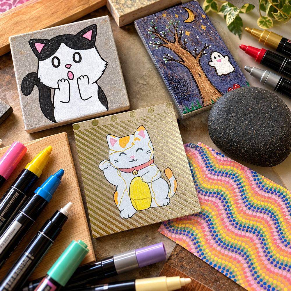
Wood is another surface I'd love to explore.
I've experimented with wood in other creative projects, and I enjoy its natural texture and character.
- Would the grain influence how a printed design appears?
- Would a smoother piece of wood produce a different result from a rougher one?
- How might the ink interact with a surface that absorbs materials differently from paper?
I can imagine some interesting possibilities, particularly with botanical designs or decorative patterns.
Then there's tile.
I've been exploring flooring samples and other unconventional materials in The Materials Lab, so of course I've wondered whether printmaking might offer another way to use them.
 Jessica Carey
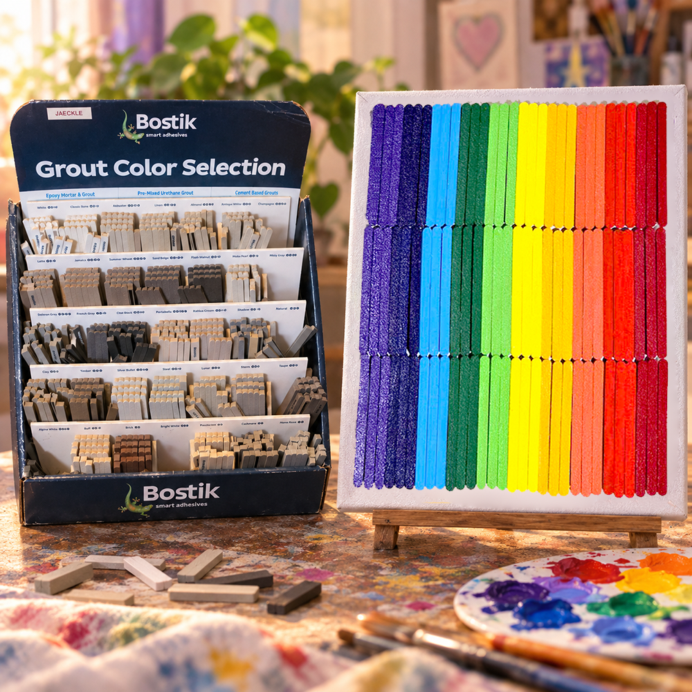
However, I suspect that a smooth, nonporous tile surface could present some challenges.
- Would the ink transfer cleanly?
- Would it adhere properly?
- Would it smudge or wipe away?
- Would it require a different type of ink or surface preparation altogether?
I don't know yet!
It's entirely possible that Cranfield's relief inks wouldn't be suitable for that application, especially if I wanted a durable finished piece.
But even discovering that a particular combination doesn't work can be useful information; that's why I enjoy experimenting.
Sometimes, the result is a finished artwork.
Other times, it's a better understanding of what a material can and cannot do.
And both outcomes can teach me something.
 Jessica Carey
Following the Questions
For now, these are ideas rather than completed experiments.
I've only tested the inks on paper using my first carved linoleum block, so I don't yet know how they'll behave with different designs, more complicated gradients, or alternative surfaces.
Before trying those applications, I'll need to consider the manufacturer's recommendations and whether the materials are appropriate for what I have in mind.
But I love having so many directions to explore.
That's one of the things I appreciate about The Materials Lab.
I don't need to know exactly where an experiment will lead before I begin.
Sometimes, all I need is a material, a question, and a little curiosity.
And thanks to Cranfield's generous contribution, I now have a whole new medium to investigate.
My first printmaking experiment may be finished, but my exploration of printmaking is only beginning!
A Thank-You to Cranfield and My Art Club
When Cranfield Colours generously offered to send me some of their Caligo Safe Wash Relief Inks, I was excited about the opportunity to experiment with a new material.
But I didn't know quite what to expect.
After all, I'd never tried printmaking before!
Now, thanks to that opportunity and the encouragement of my art club, I've designed and carved my first linocut, created three colorful gradient prints, and discovered an entirely new medium I'm eager to explore further.
And I have quite a few ideas for what I'd like to try next!
A Little Generosity Goes a Long Way
I'd like to extend a heartfelt thank-you to Cranfield Colours for generously providing the Caligo Safe Wash Relief Inks and color-mixing guides that made these experiments possible.
Having access to quality art materials can make a meaningful difference, especially when exploring an unfamiliar technique.
Not only did Cranfield's contribution give me an opportunity to try printmaking for the first time, but it also introduced my fellow art club members to materials they were excited to explore.
And I love that!
What began as a chance for me to experiment with some new inks quickly became something we could share.
I'm especially grateful that Cranfield included the color-mixing guides, which will be helpful as I continue learning about the inks and exploring new combinations.
There's still so much I haven't tried, and I'm looking forward to seeing where these materials take me.
Thank You to My Creative Community
I'd also like to thank Marnie at Marnie's Creative Outlet for providing the linoleum, introducing me to the process, and encouraging me to experiment.
And thank you to my fellow art club members for sharing their enthusiasm, experiences, and creative ideas.
One of the things I appreciate most about art club is that everyone brings something different to the table.
We have different interests, different levels of experience, and different ways of approaching our projects.
But those differences give us opportunities to learn from one another.
And sometimes, a conversation about art materials turns into an idea for a holiday print exchange!
I'm excited to see whether that idea comes together and what everyone might create.
Here's to More Creative Discoveries!
One of the things I appreciate most about trying unfamiliar materials is that I never know exactly where an experiment will lead.
In this case, I started with a piece of linoleum, a cute cat design, and some beautiful inks I had never used before.
I ended up with three colorful prints, a new artistic technique to explore, and an unexpected opportunity to share that excitement with other artists.
There's still plenty I'd like to investigate, from more elaborate gradients to different designs and printing surfaces, and I'm looking forward to seeing whether our art club's holiday print exchange comes together!
But perhaps my favorite discovery wasn't a particular color combination or printing technique.
It was seeing how one creative opportunity could spark so much enthusiasm among other people.
A few tubes of ink became three colorful prints, a new artistic adventure, and the possibility of a shared creative project.
That's a pretty wonderful outcome for a first experiment!
And it's another reminder of why I love The Materials Lab: creativity has a wonderful way of opening doors we didn't even know were there.
Until next time, keep creating, experimenting, and following your curiosity!
Want even more content about creativity and art?
Be sure to check out all of our creative chronicles!
If you'd like to see examples of my work, you can find some of my art and creations at Redbubble and Gumroad!
Looking to learn more about my recent journey?
Check out some of these articles:
-Hidden Gems for St. Louis Artists
-Perennial Copper Jewelry Class
-Perennial DIY Watercolors Class
-Perennial Paper Bead Earrings Class
-Leftovers and Upcycle Treasure Box
 Jessica Carey